WeMoney: Onboarding redesign & branding
WeMoney is an Australian startup building towards a future where everyone has access to a better life through financial wellness. This case study looks at two projects I lead: Optimising the onboarding funnel and branding.


Onboarding optimisation
To improve on OKR’s like customer acquisition cost, improving the onboarding funnel is a potentially high ROI place to look.

Challenge
Improve onboarding conversion rate from 25% to 35%
Reduce CAC from >$30 to $25 or lower
Based on our analytics, the highest drop off steps were the welcome screen and driver’s licence step.
What I did
Discovery: review of Amplitude, user testing and researched competitors and peers.
Hypothesised possible solutions and shortlisted highest potential ROI bets
Outcome
8% -10% total improvement on user drop-off for 2 key steps in onboarding funnel
Clearer, more transparent flow that addressed user pain points uncovered in user testing
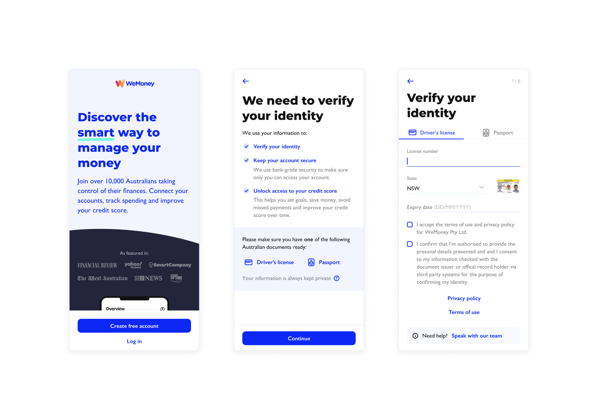
Looking at the analytics, we saw a prominent drop-off at the license step. In user testing, 3/5 participants were surprised WeMoney asked them for their ID during signup. I hypothesised if we could prime users ahead of that step and explain why their ID was needed, we could reduce surprised and increase trust.
I also found that 3/5 participants were unaware of WeMoney’s credit score feature. I hypothesised that if we reminded users of this feature and explained their ID was needed to access it, users would feel more comfortable proceeding.
3/5 users said they would intentionally avoid providing their ID by tapping a button labeled ‘Don’t have your license?’. I reduced the prominence of the button and adjusted the microcopy to ‘Need help? Speak with our team’ to clarify the button wasn’t a way to skip this step.
Design rationale
Because 3/5 users were surprised when asked for their ID, adding a screen to prime users and explain why we need their ID will decrease drop off from 22% to 15%
Because 3/5 users were unaware of WeMoney’s credit score feature, educating users on the credit score feature prior to verifying their ID will increase trust and reduce drop off from 22% to 15%
Because users reported apprehension in providing their ID and personal information, adding “Your information is always kept private” microcopy at key points in the flow will help increase total conversion by 5%
3/5 users tried to press ‘Don’t have your ID?’— updated microcopy to ‘Need support?’ will help reduce drop off from 22% to 15% and reduce incoming support queries by 10-20%
Branding and website design
In preparation for WeMoney’s launch in 2020, I lead a branding project in order to create the startup’s first website and design system.

Challenge
Create a brand and visual identity for WeMoney
Create a design system for WeMoney
In 2 weeks, publish a website and create an App/Play Store page to prepare for launch
What I did
Branding exploration
Responsive website specs
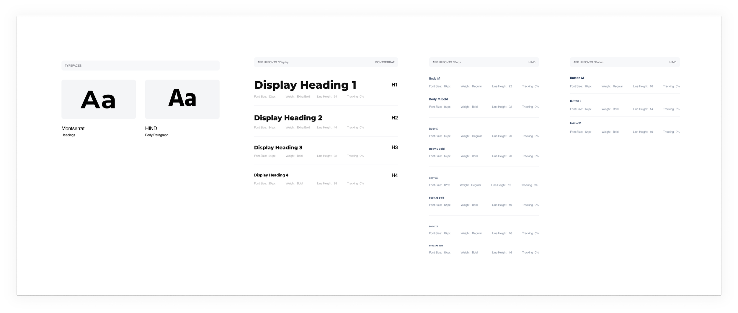
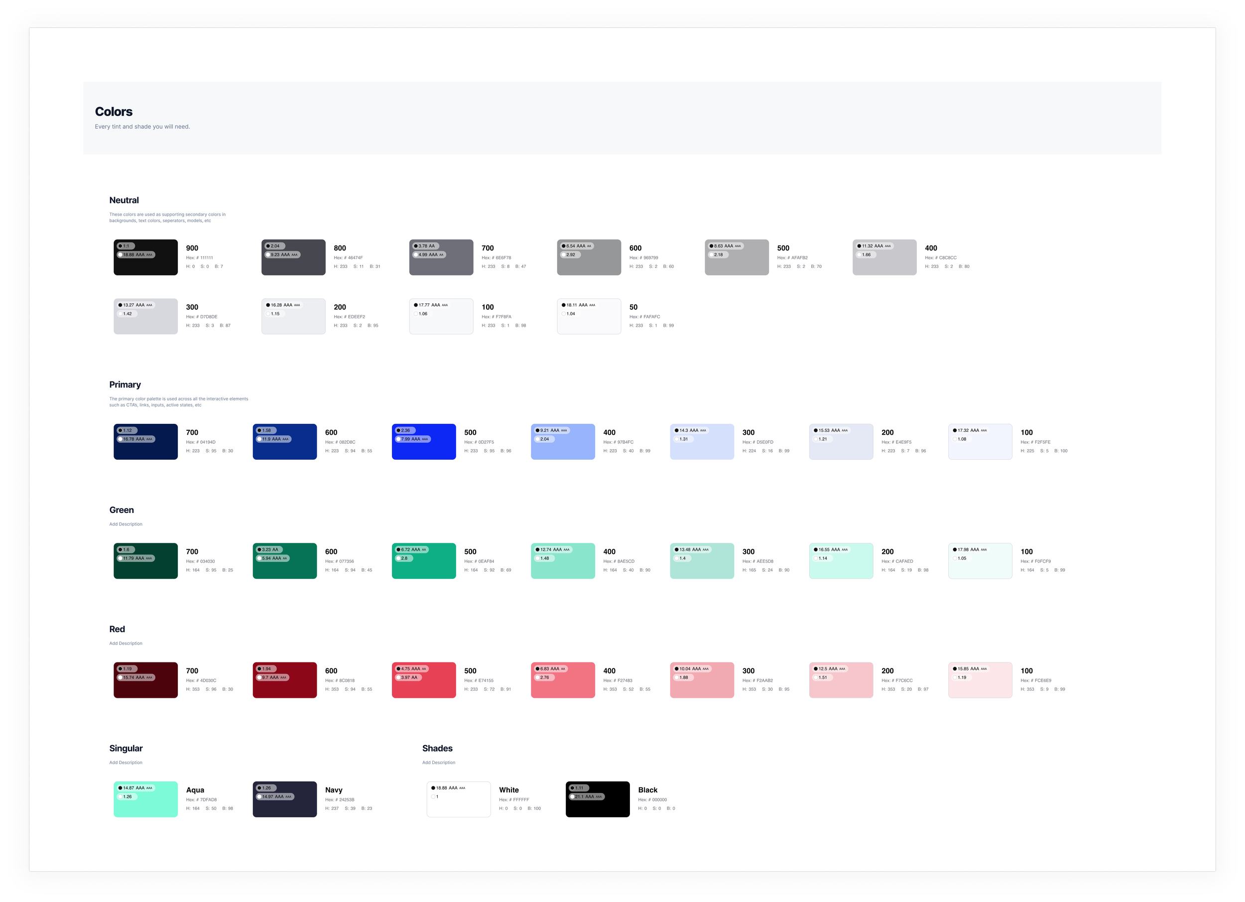
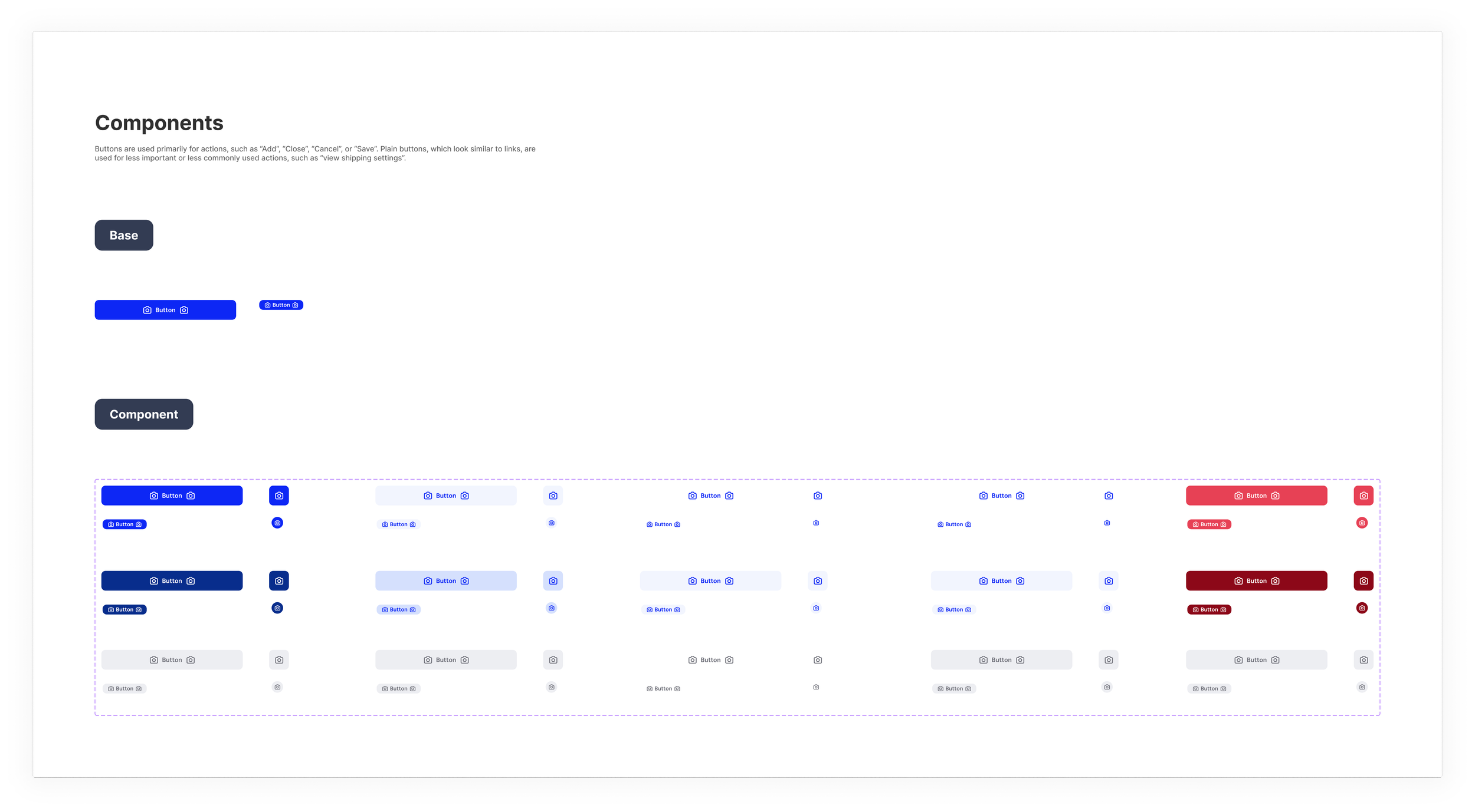
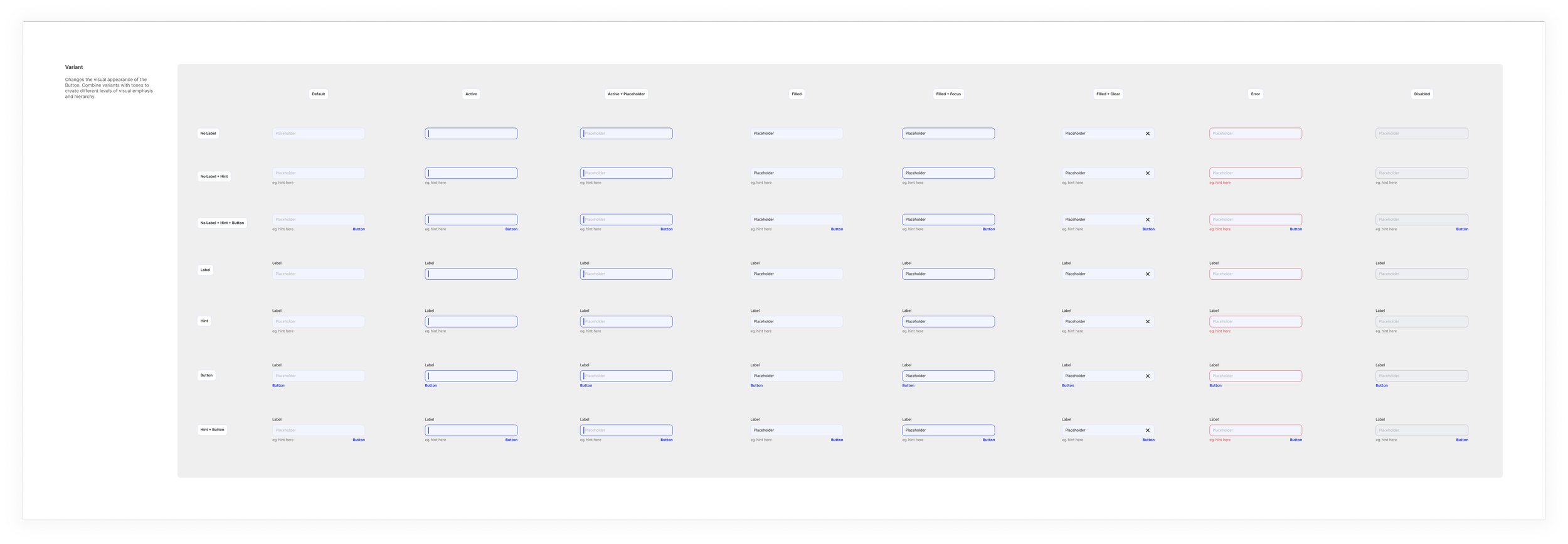
Created WeMoney’s first design system
Outcome
Provided a platform to begin growing our user base at a rate of 5,000 users per month.
Laid the foundation for WeMoney: the design system and branding was flushed through the app, marketing material and the App Store/Google Play Store.
Discovery and design process
I performed a branding discovery exercise with the CEO to uncover WeMoney’s mission, vision, target users and brand attributes. We collaborated on a massive google doc where I prepared questions to help get at the core of who WeMoney was.
I gathered inspiration and examples of ways we could visually communicate brand values and attributes.
Stylescapes helped us decide on a direction. Each one showcased how a potential style applied to a website, ad and mobile app. Exploring multiple directions for our brand helped us refine a look and feel that felt uniquely WeMoney.

Some of the stylescapes that helped us hone in on a branding direction for WeMoney.
WeMoney’s first website

WeMoney’s landing page

WeMoney’s careers page