
WeMoney Pro — Building a Premium Tier
Designing and launching WeMoney Pro, the company’s first paid subscription, to drive scalable, recurring revenue while strengthening member retention and engagement.
Challenge
Introduce a scalable, long term revenue stream without compromising user experience
Enhance user value and retention by allowing users to gain deeper financial insights
What I did
As Lead Product Designer, I partnered closely with our CEO, engineers and growth team
Designed the end-to-end Pro experience, including onboarding and paywall flows
WeMoney Pro branding and web design
Outcome
+10% - 15% monthly revenue
+23% increase in trial activations within the first year
+15% uplift in retention among paying users compared to free
WeMoney had built a strong foundation as a free app helping Australians track spending and improve their financial wellbeing. However, monetisation relied heavily on partnerships and affiliate conversions—channels that were unpredictable and difficult to scale.
WeMoney Pro was an opportunity to introduce scalable revenue into the business while adding more value that users would be willing to pay for without compromising the free experience. This required a careful balance between product, brand, and business strategy, while also tying this into our existing design system and brand values.
Design process
1) Defining the problem
I started by turning a complex, vague opportunity space into a more defined, structured process. I began with framing the hypotheses, business and user objectives as well as metrics we would use to measure success of the project. I then worked with the CEO and engineers to define the Pro value proposition, pricing model, and user experience.
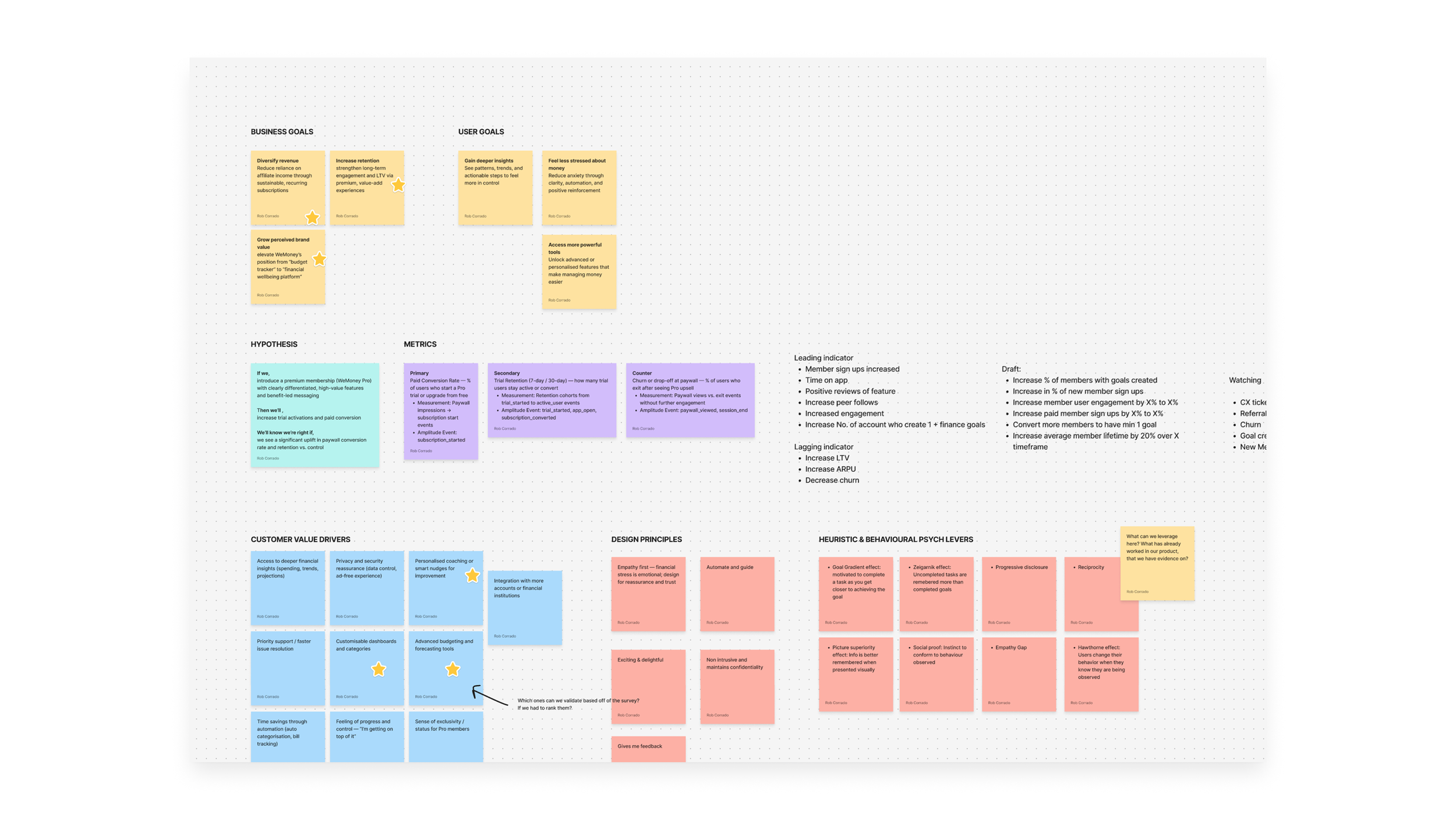
One of my discovery files—this helps me organise project goals, metrics, amplitude events, user value drivers & more. Things to keep in mind throughout the design process.
2) Discovery
Gathering qualitative and quantitative data
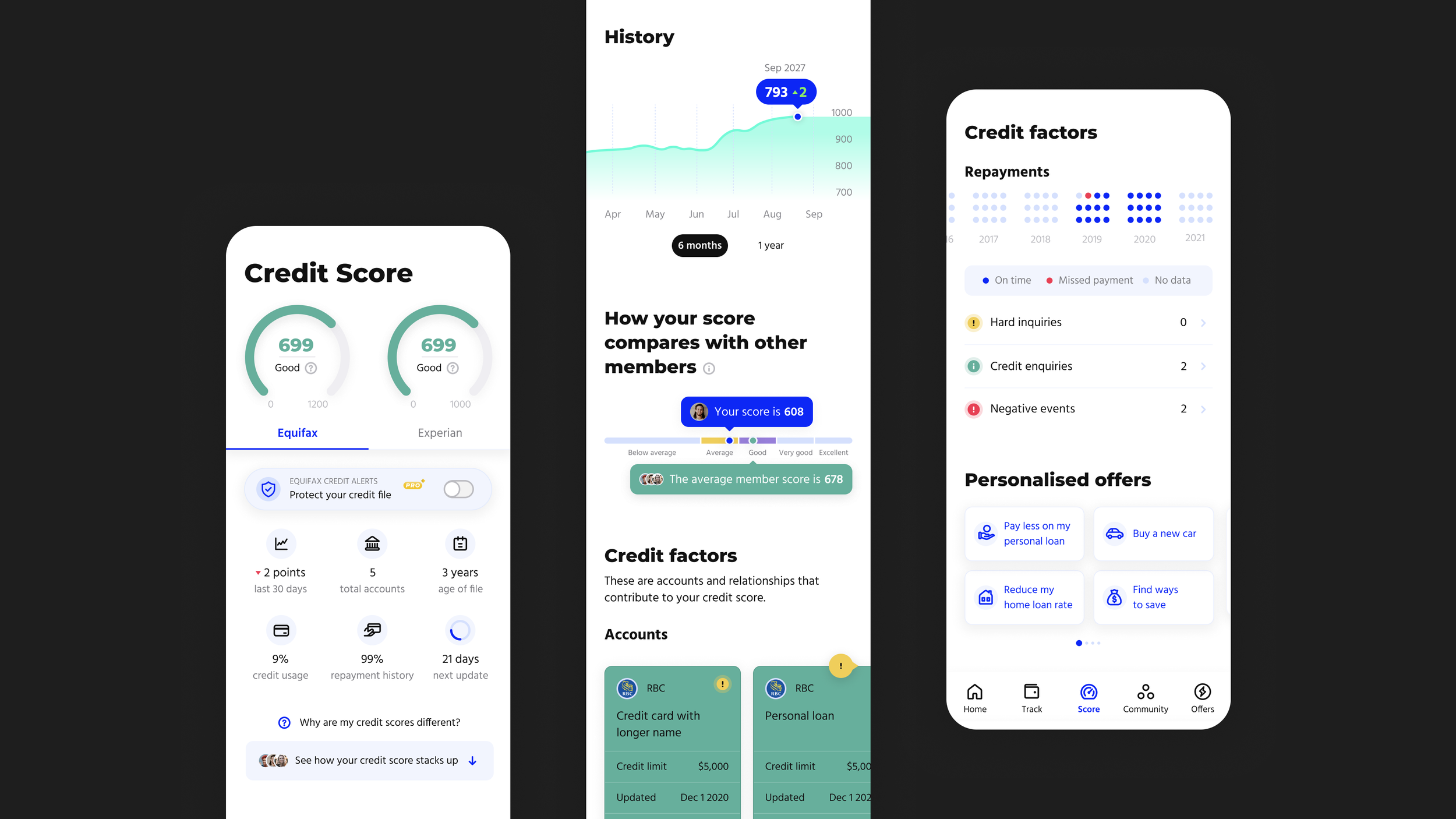
I began by analysing user behaviour and qualitative insights to identify features people consistently valued. In bug reports, onboarding surveys and app reviews, we uncovered the top features members asked about: custom expense categories, advanced budgeting tools, deeper financial insights, and credit score alerts.
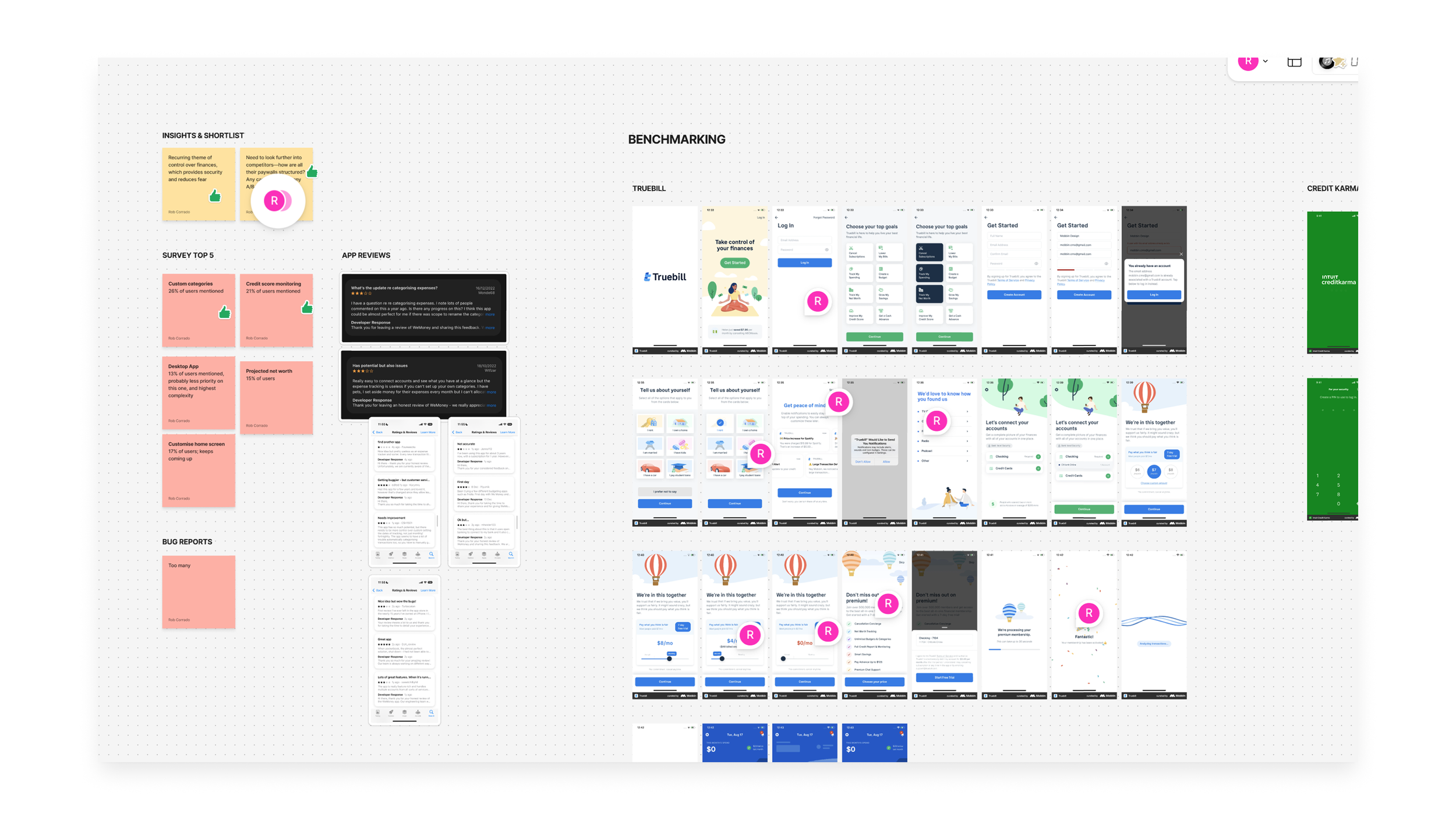
One of my discovery files where I complied data and competitor analysis
Competitor analysis and benchmarking
I looked at top paid apps in a variety of industries to understand paid tier best practices, pricing structure and common pitfalls in communicating value. Emma and Rocket Money in the personal finance industry as well as apps like Uber Eats and Hinge helped shape our understanding.
Shortlisting bets
I created an ICE matrix, which helped us prioritise potential Pro features by perceived value, design and engineering difficulty, as well as confidence (based on our member data and already existing products in the market). Our approach was MTV thinking: minimum viable test. We asked ourselves: what features could we include in a first test of WeMoney Pro that had the lowest possible risk?
I.e., Credit alerts could deliver massive user value by mitigating fears and enhancing security, but was highly complex as it required negotiation with Equifax. At the same time, we knew users were already paying for this feature in the current market, so we felt comfortable including this in the initial feature set.
3) Workshopping ideas with engineering
In terms of workflow, we went feature by feature. For each, I showcased discovery work, potential user flows and initial wireframes to the engineers and CEO. This helped me gather feedback and uncover unhappy paths and edge cases early on.
For example, presenting user flows on subscription management allowed me to find answers to questions like:
What happens to a user’s custom categories if they unsubscribe?
How will we manage payments and refund requests from our members?
What technical complexity can we expect having free and, now, paid cohorts of users in our product?
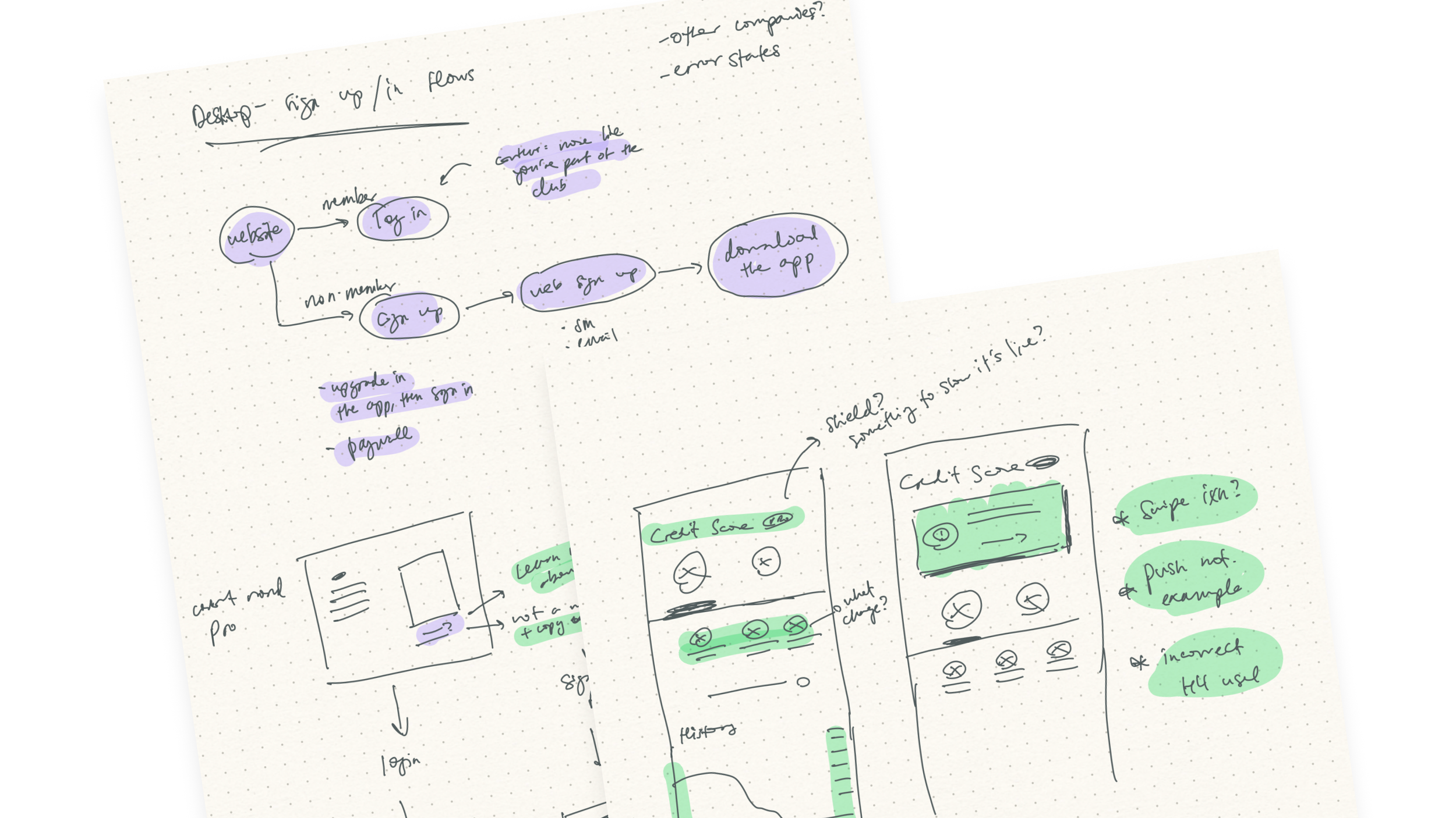
Sketching helps me work efficiently, testing multiple ideas, uncovering unhappy paths, questions for devs and sense checking.
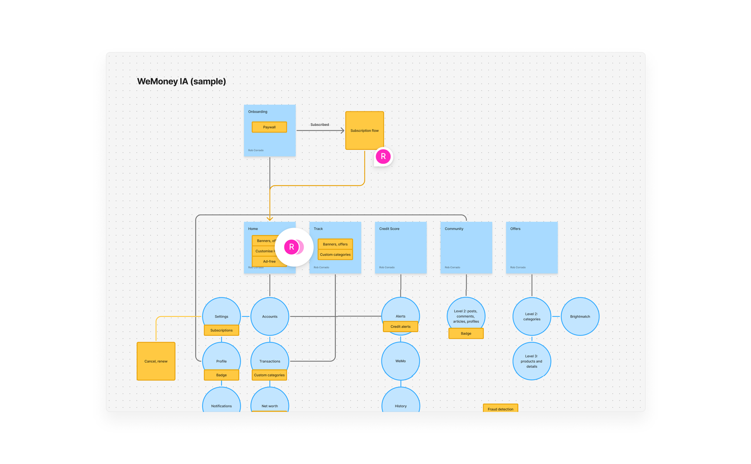
Mapping WeMoney’s IA helped me understand where entry points into the Pro experience could be and how everything linked together.
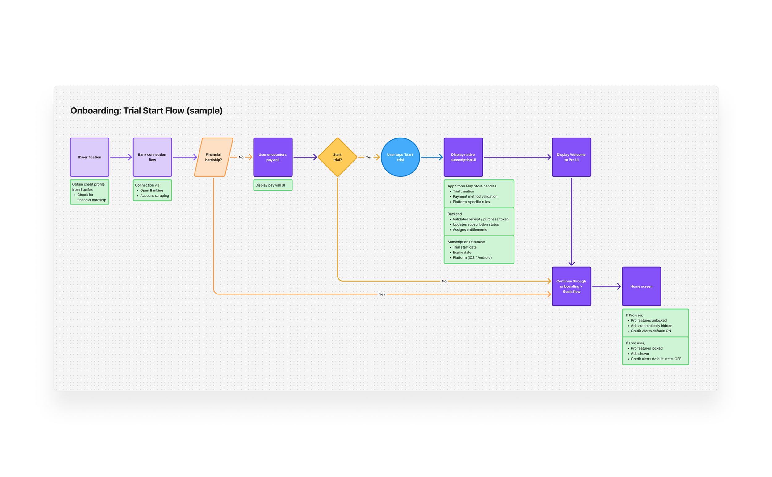
Mapping user flows helped me understand the interactions between the user, the frontend and underlying systems like our subscription database, payments, and receipt validation.
Execution and Outcome
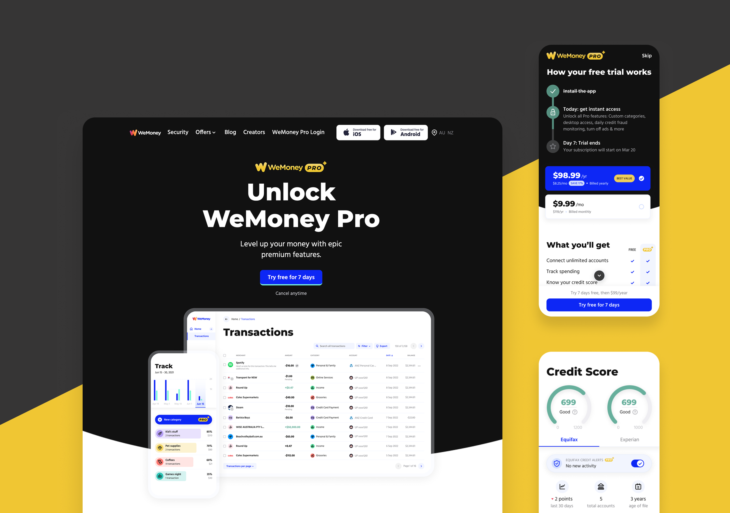
We launched WeMoney Pro with three core value pillars: Smarter Insights, Transparency, and Enhanced Privacy—supported by a monthly and annual plan. The paywall experience integrated seamlessly into existing user journeys, minimising friction and preserving brand trust and transparency.
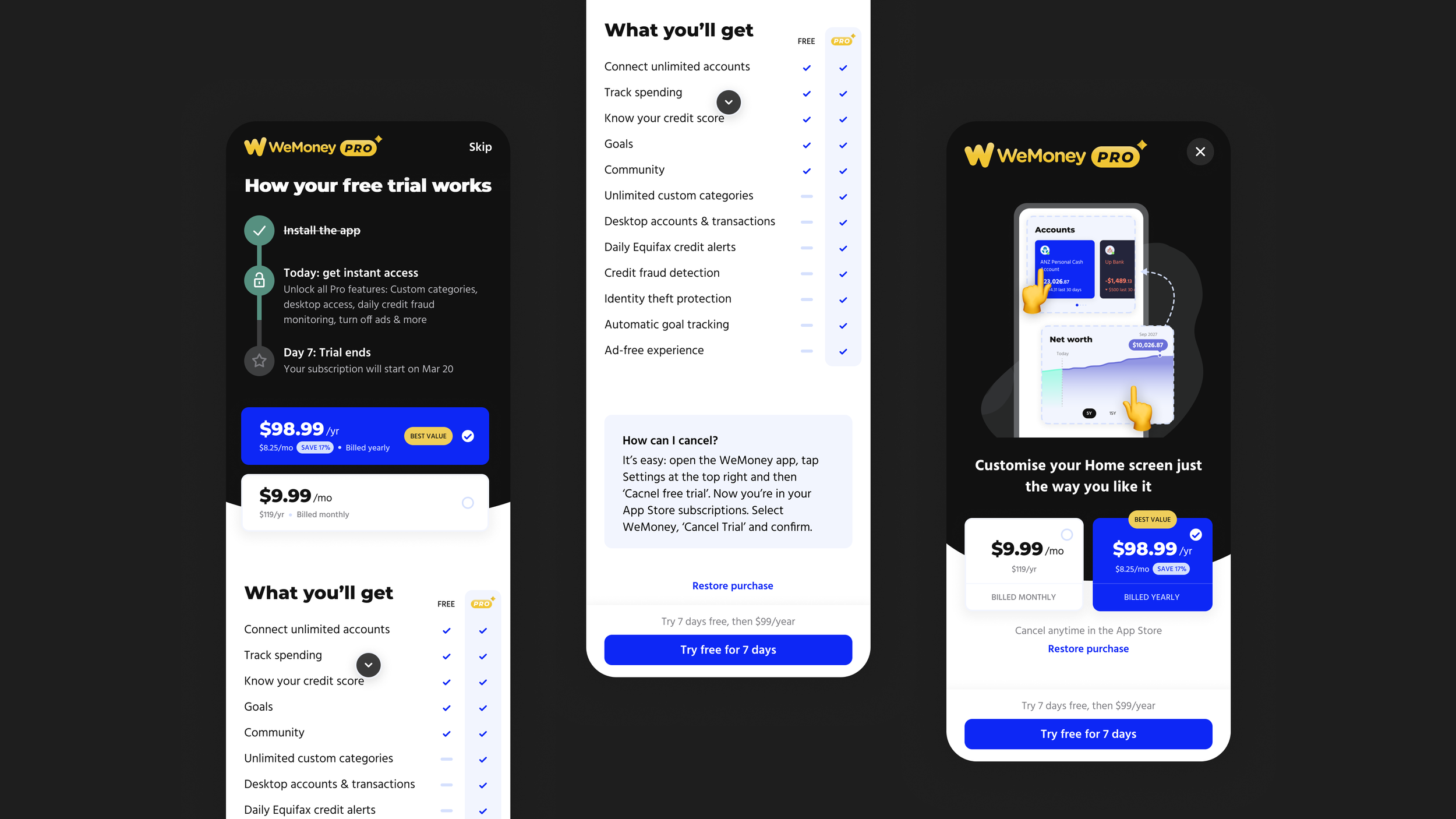
Paywall designs
I designed a modular paywall system that could support A/B testing of messaging, visuals, and pricing tiers. This allowed us to rapidly experiment and increase paywall conversion by 23% in the first year after launch.
Paywall user testing showed members responded best to benefit-driven framing rather than feature lists. I.e., “Gain clarity and control” performed better than “Unlock unlimited budgets.”
Post-launch, we saw:
+23% increase in trial activations within the first year
+15% uplift in retention among paying users compared to free
Learnings on messaging hierarchy and feature salience, informing future monetisation and paywall experiments
A key design challenge was maintaining trust and transparency: We didn’t want users to feel like essential features were being locked away. To address this, I introduced contextual Pro prompts within the free experience—subtle, value-led cues that explained why a feature was premium and how it could help users reach their goals faster.
Because trust is so important in personal finance apps like WeMoney, we didn’t want to do was interrupt users with unexpected paywalls that felt like upselling. We also wanted to be transparent with pricing structure, trial timelines, always communicating clearly with users.
What I Learned
1) Building WeMoney Pro reinforced the importance of designing monetisation with empathy. It’s easy to have a narrow focus on the how to drive revenue, but sustainable monetisation comes from aligning with genuine user value and trust.
2) It also highlighted how premium experiences can elevate brand perception when done thoughtfully. I think WeMoney Pro signals the the company’s growth and maturity, rather than just a paid tier to help generate income. At the same time, users’ expectations grew—especially paid users.
3) Finally, as someone who usually finds paywall intrusive, I now believe that, when done thoughtfully, paywalls can serve as an invitation rather than a hinderance in the experience.
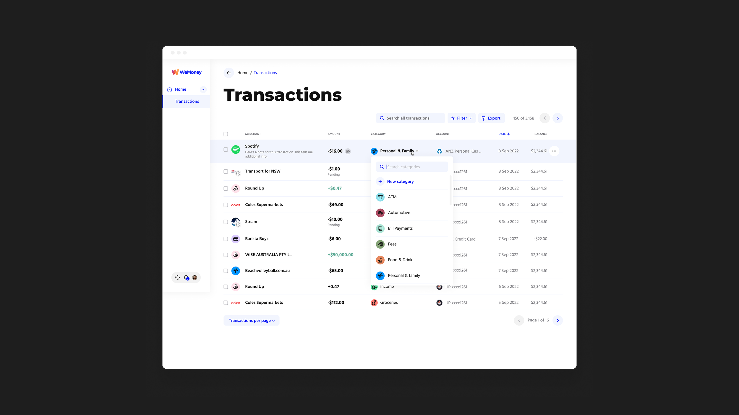
WeMoney Pro: Desktop—categorising transactions
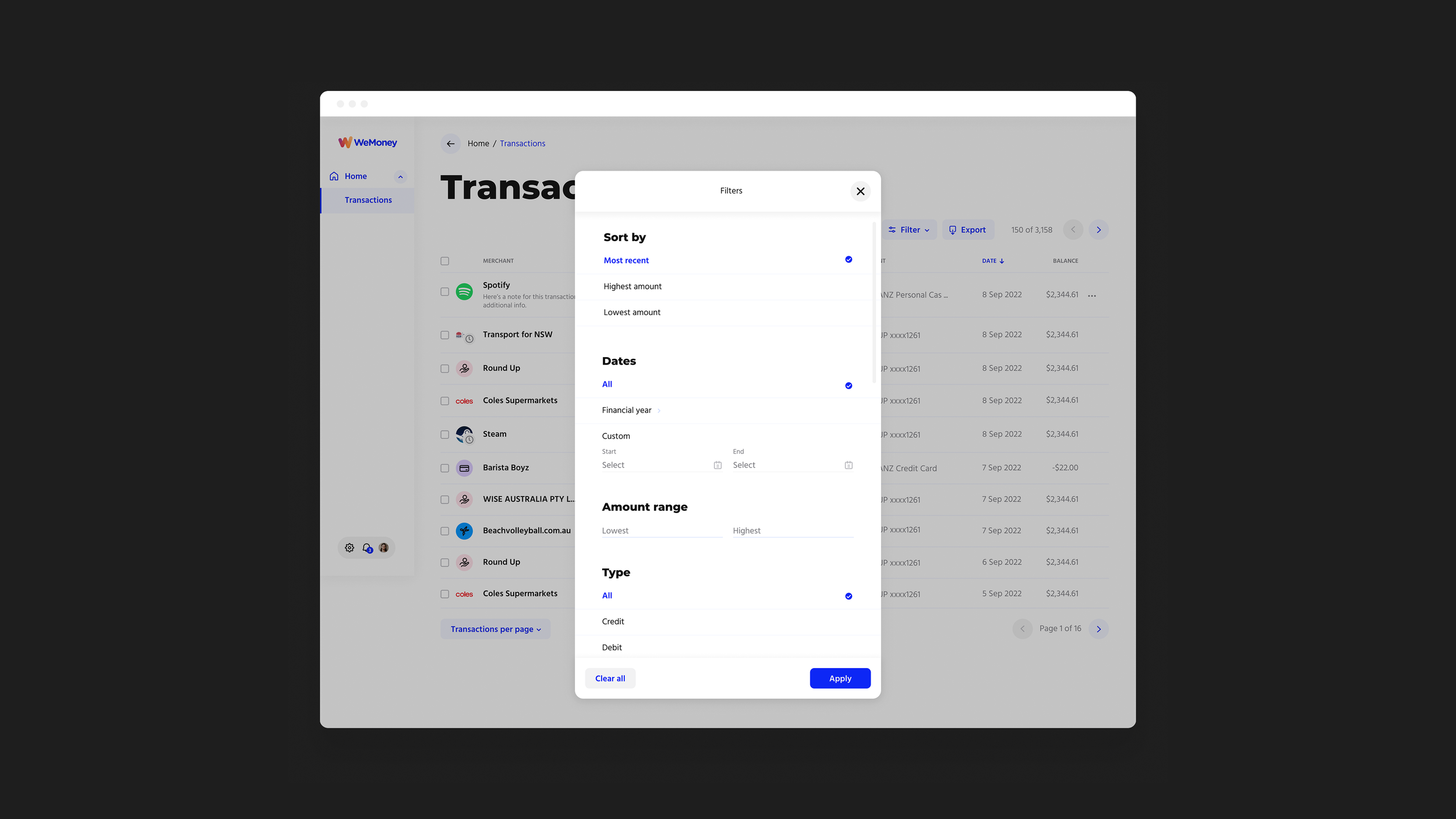
WeMoney Pro: Desktop—filtering transactions

WeMoney Pro: Custom categories, and some of the interactions within
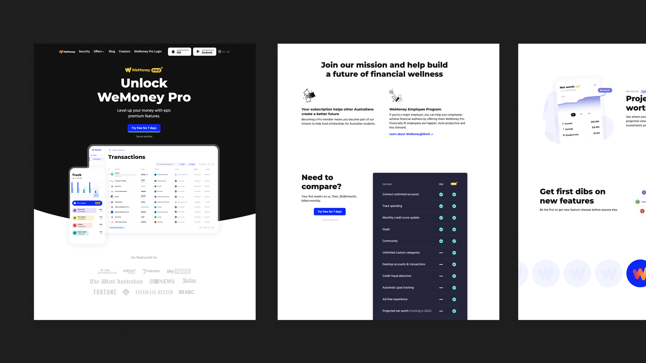
WeMoney Pro’s landing page