
Snap Ship: Canada Post's Online Shipping Tool
After usability testing, we identified several user pain points and redesigned SnapShip, Canada Post’s most profitable online shipping tool.
Challenge
Redesign Snap Ship: convert usability testing insights into an improved shipping experience.
My role
Lead product designer, working with other designers, developers, UX writers, product owners and stakeholders
Delivered road maps, user stories, prototypes, test plans, polished specs and documentation.
Outcome
Increased Snap Ship’s monthly revenue by $300,000 (20%)
Improved the product team’s workflow by introducing new, refined design system components
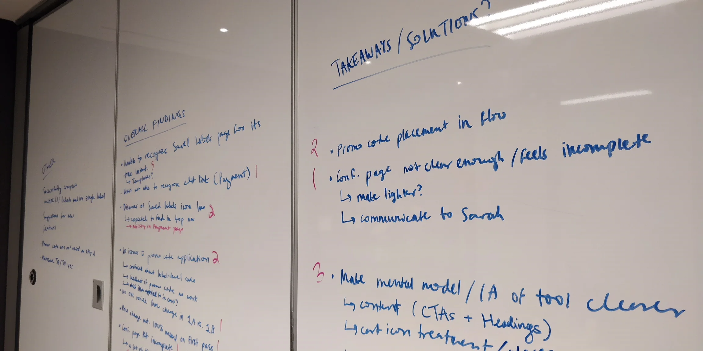
Key user pain points
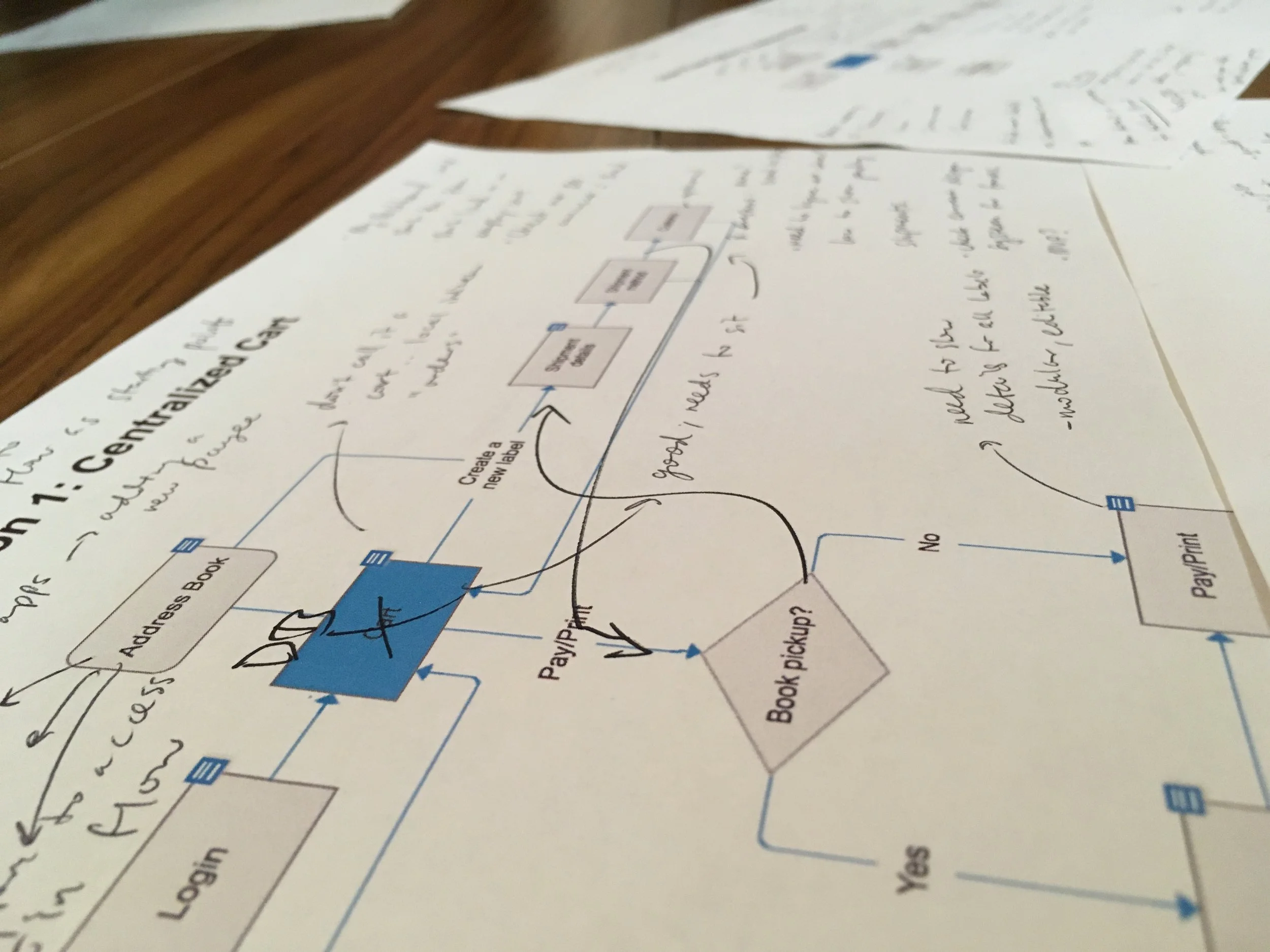
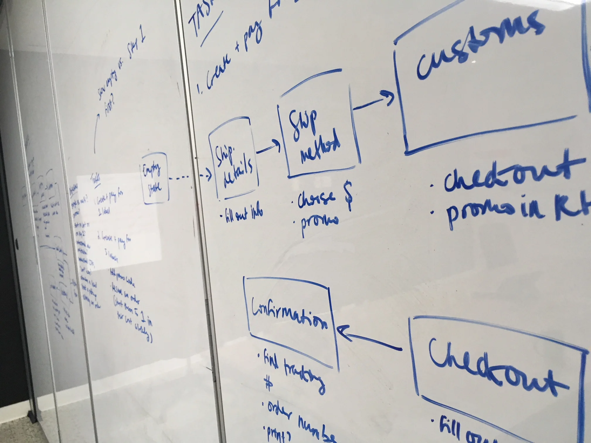
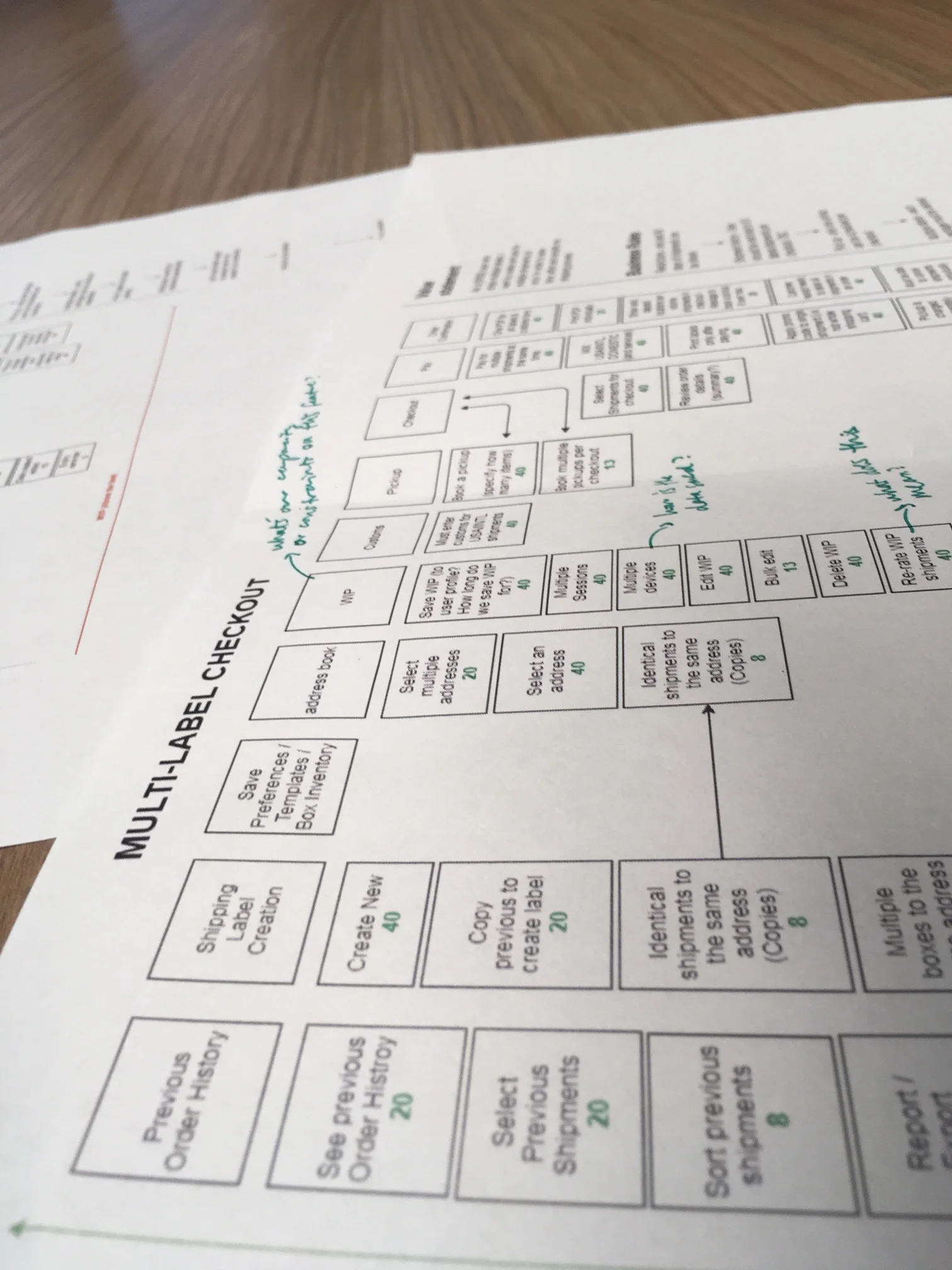
1. Inefficient order creation
Countless users requested the ability to create multiple orders at once in order to save time.
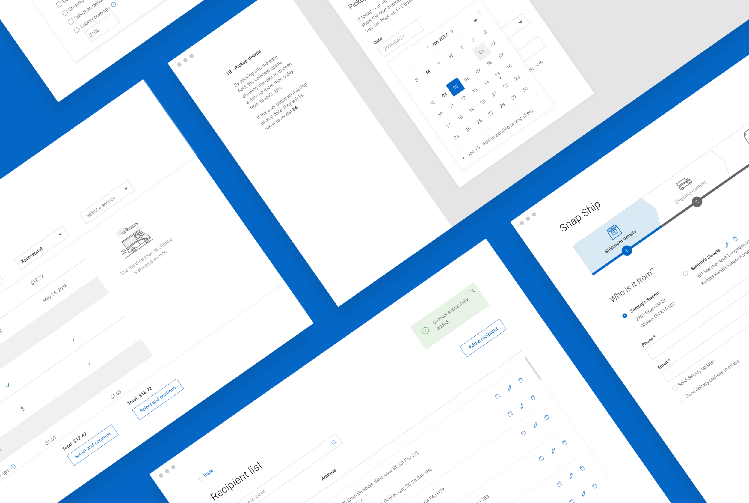
After researching companies in similar markets, we proposed several flow updates that would accomodate this change. Presenting this to stakeholders and developers early on helped ensure we were on the right path.
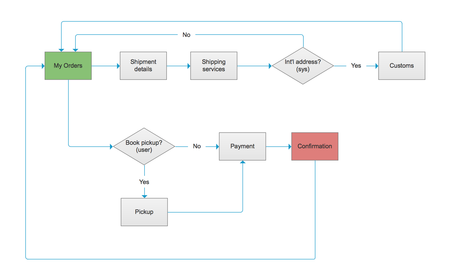
This user flow sparked early conversations to help align the product and business teams.
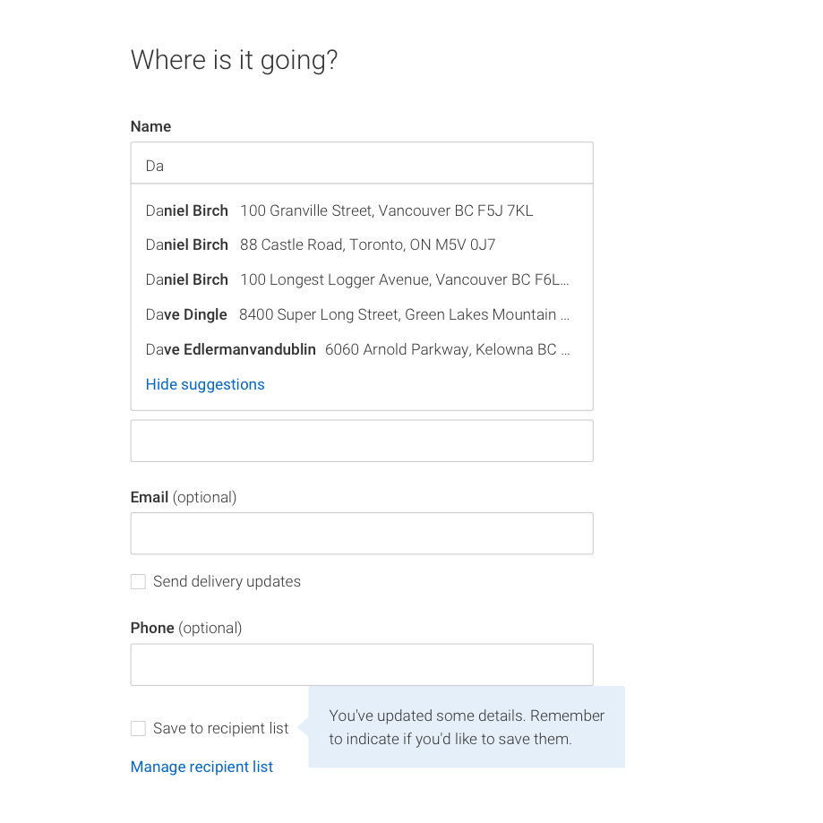
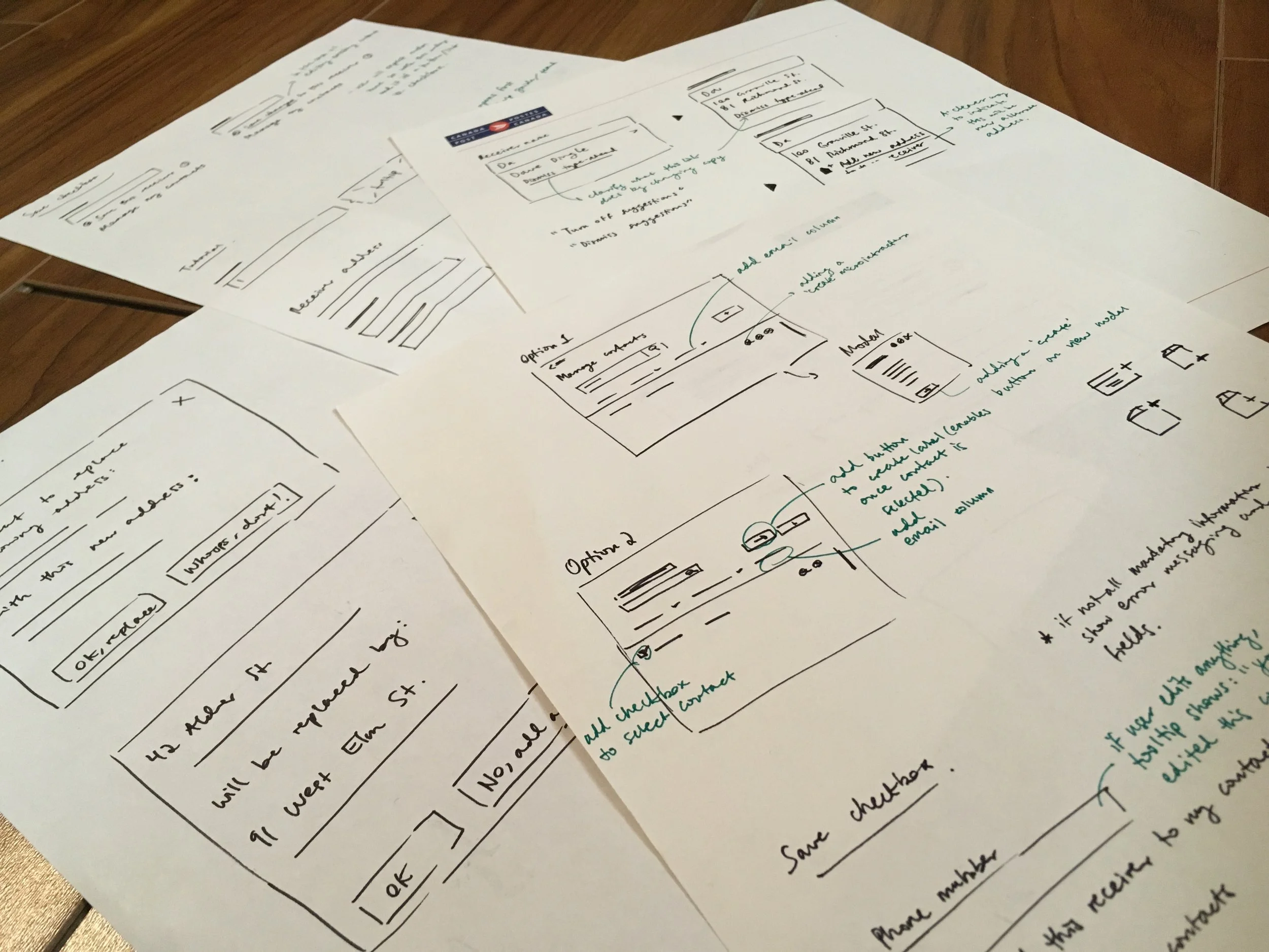
2. Contacts aren’t saved within the tool
Users were really missing an integrated address book for their contacts.
We tested our solution, shown here, to validate workflows like saving, viewing, editing and deleting existing contacts.
Key findings:
All participants were confused by the interaction of overwriting an existing contact—we questioned whether this complex functionality was worth having.
Some users preferred to begin by looking up contacts rather than setting up shipments—provide flexibility for different workflows.
Some users overlooked the address book altogether— was there a way to make it more discoverable?
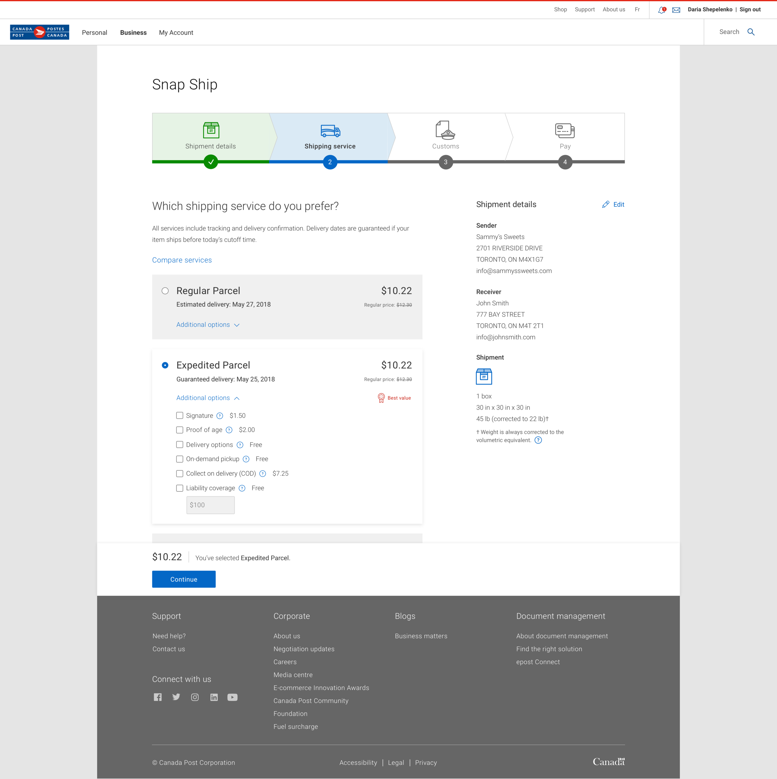
Revisiting shipping methods
We leveraged our new design system, Mercury, to refresh the UI and create more concise interactions and content.
Auditing the previous design
We revisited the users’ main goal: quickly see total cost and shipping speed, then make an informed selection.
Pain points:
It isn’t obvious how to proceed on this step
The main CTA is hidden until a selection is made
Cluttered look and feel; not all content was relevant
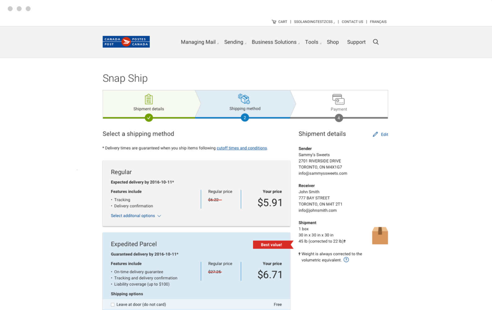
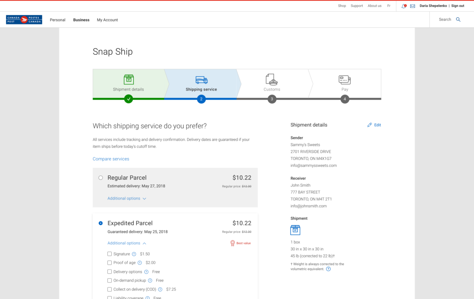
The updated, validated design
Prioritised key content: price and delivery dates
More discoverable controls
WCAG compliance
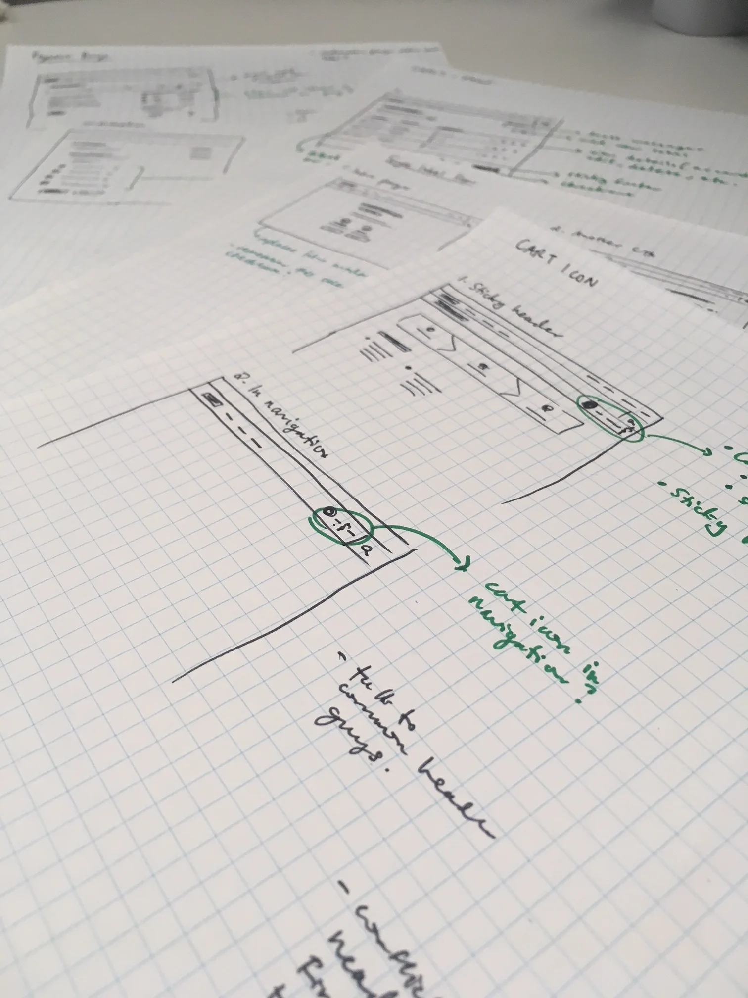
We had to justify adding new components to our design system, like the sticky footer, which other designers could now use in their projects.
Highlights from the design process
The outcome
As we addressed key user pain points, one sprint at a time, there were several notable outcomes:
$300,000 (20%) increase in monthly revenue
Improved the product team’s workflow by introducing new, validated components
Shipping services: redesigning this page allowed us to prioritise high-value information for customers: price and delivery date.
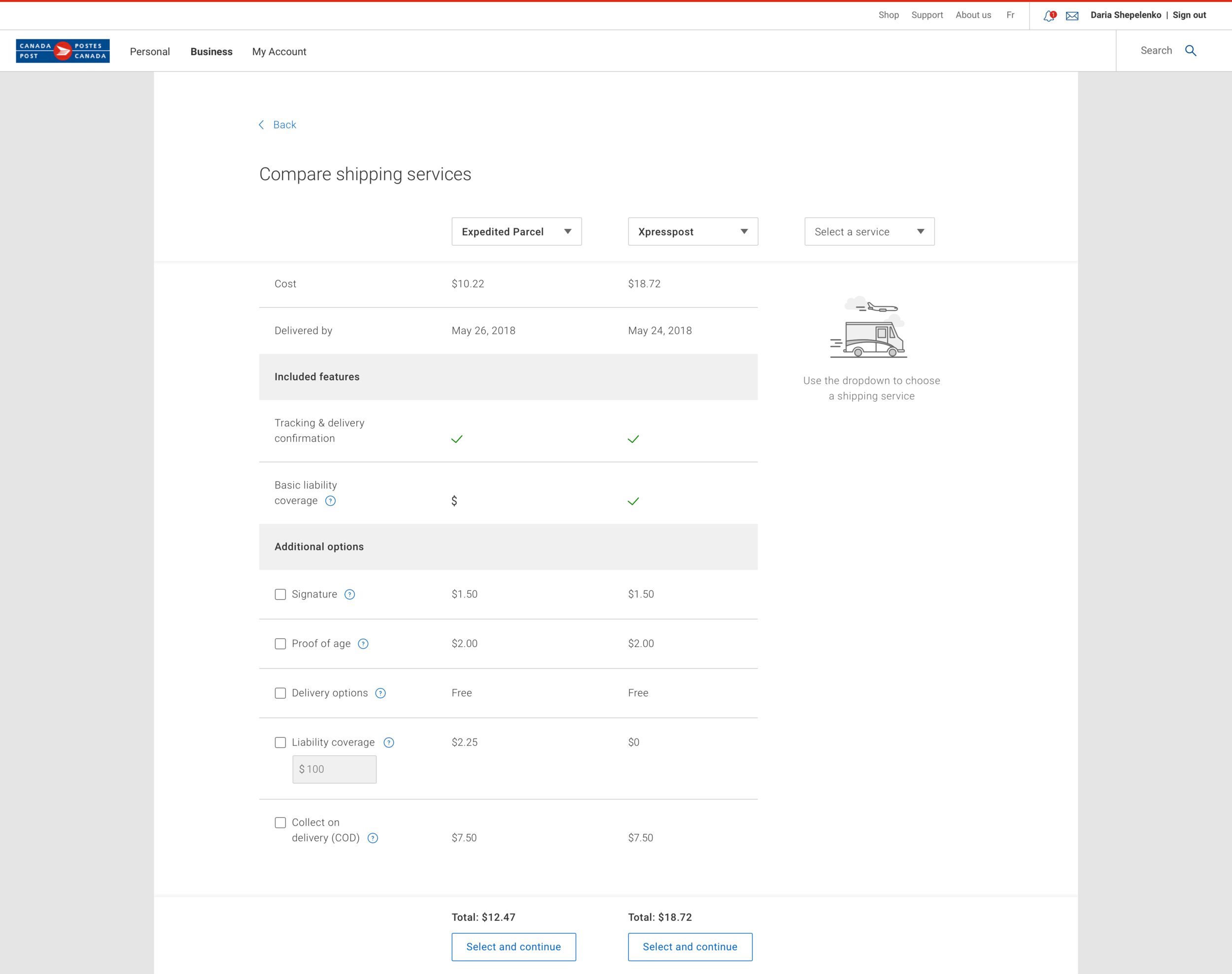
Compare shipping services: users can choose the most optimal service for their customer without having to leave the app.
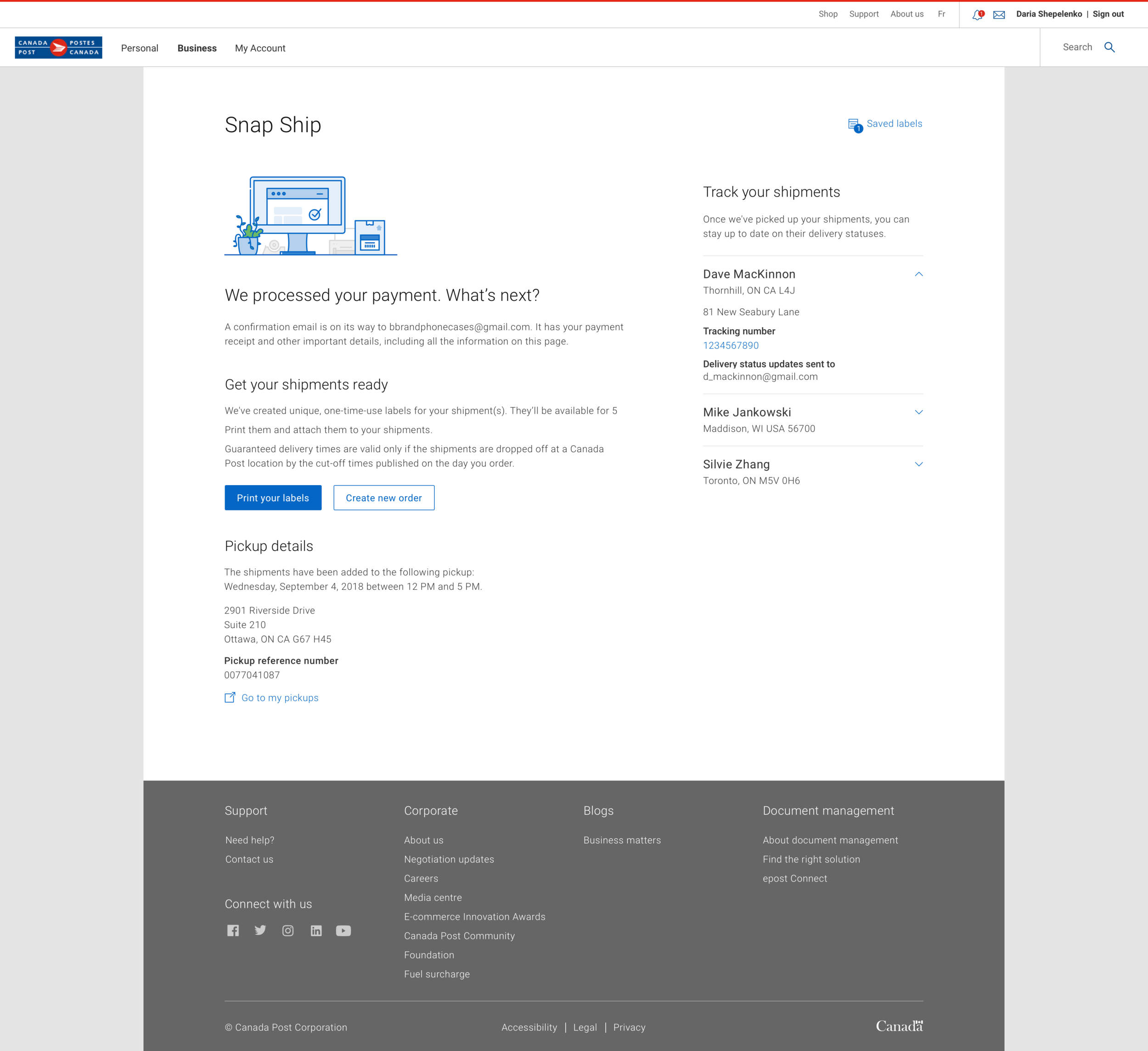
Confirmation page: the most relevant information is presented while allowing users to continue their workflow by creating another shipping label.
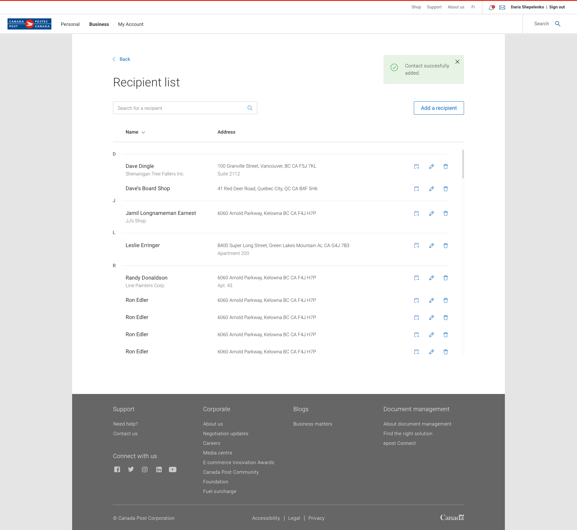
Recipient list: a highly requested feature allowing users to save and manage contacts. We expected users to only reference the address book occasionally. However, in usability testing, we discovered that many users expected to be able create a shipping label from this page.
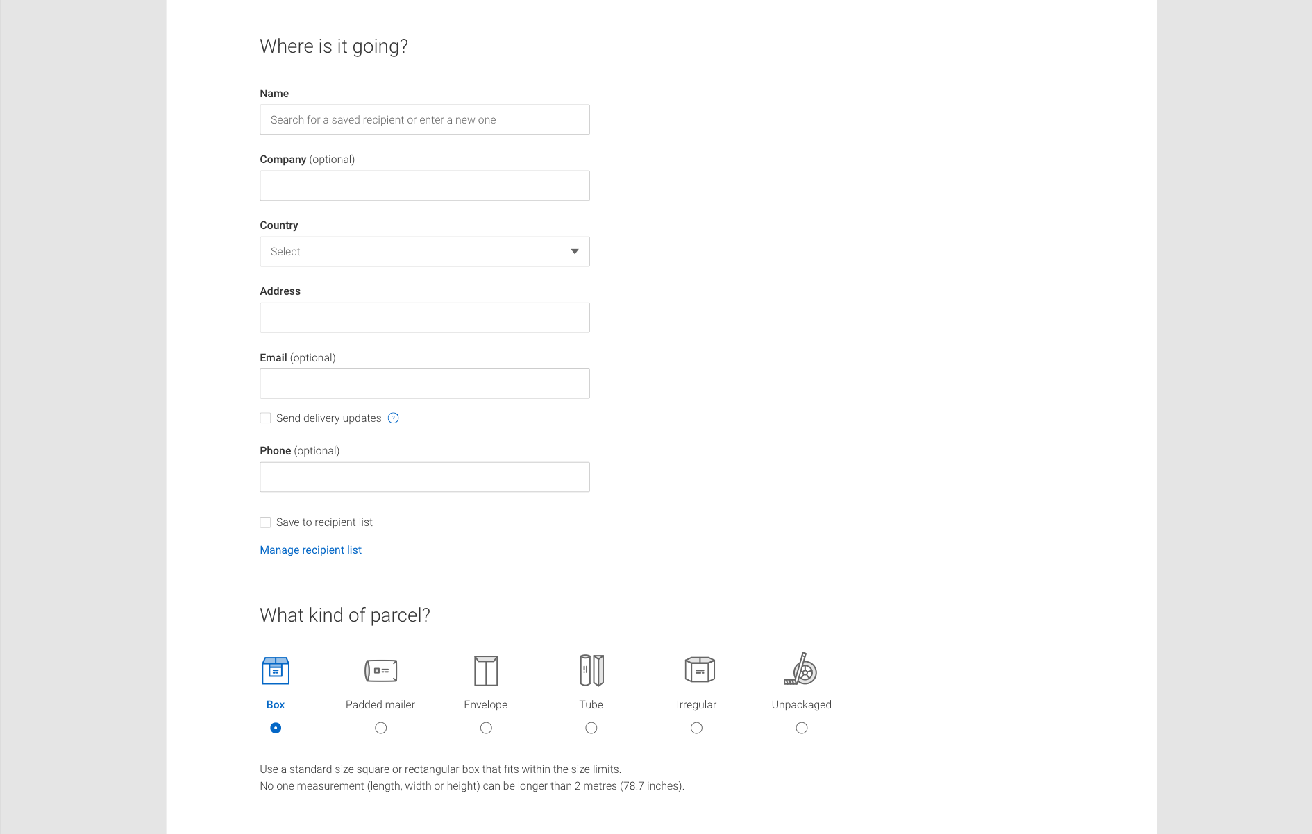
Shipment details: users seamlessly access their recipient list by typing in the customer’s name.
What I learned
1. Collaboration is key. I’ve always been an advocate for involving everyone—in this case developers and project managers—in sketch sessions and design critiques. We had some great results: feedback, ideas and insights from multiple perspectives and talking through development constraints early in the design process.
2. Life as an entrepreneur. Working directly with our target users taught me a lot about small business owners—their pain points, lifestyles and motivations. I’ve been able to bring this valuable experience to my role at Autopilot and to my own entrepreneurial explorations.