Canada Post: Illustrations & Iconography
I lead the creation of an illustration and iconography design system that’s had a massive impact company-wide, allowing the product to feel more professional, cohesive and personable.

Challenge
Create a unified illustration style for Canada Post to be used company-wide across multiple channels.
Deliverables
Lead product designer, working with other designers, developers and stakeholders.
200+ custom assets and an illustration/iconography design system
Outcome
Massive impact to content cohesiveness and professionalism across Canada Post’s digital and print channels
Increased speed of the product team’s workflow by providing reusable assets and guidelines

Uncovering brand values
It was important to think about our voice as a company. Who are we? What comes to mind when you think of Canada Post?
With the help of our branding department, I came up with a list of adjectives that helped our team capture what qualities to aim for.

Exploring possible styles
I assembled a variety of illustration styles and asked my team to comment on what worked and what didn't work and why. This allowed us to focus on a handful of potential styles that best fit with our brand.
Testing and iteration
We tested each potential style in the context of our product pages, apps and physical marketing material. Every iteration was printed out and critiqued in order to converge on what worked best.


Distinguishing ourselves
As we researched and experimented, our personal style began to emerge in the details:
Line breaks, highlights and shadows add character and realism
The use of background objects and plants add personality and idiosyncrasy (things that help users connect with our product psychologically)
A carefully arranged palette that adheres to brand colours
The outcome
With careful planning, our solution translated well—from smaller microactions to larger, more descriptive illustrations. We presented the final iconography and illustration family to our director of branding and implemented our new style across every product, including our Business website (www.Canadapost.ca/business).
The result was a massive impact on cohesiveness, professionalism and tone of voice across all channels at Canada Post. The product team now had access to over 200 assets and guidelines for creating new assets, improving the efficiency of our workflow.

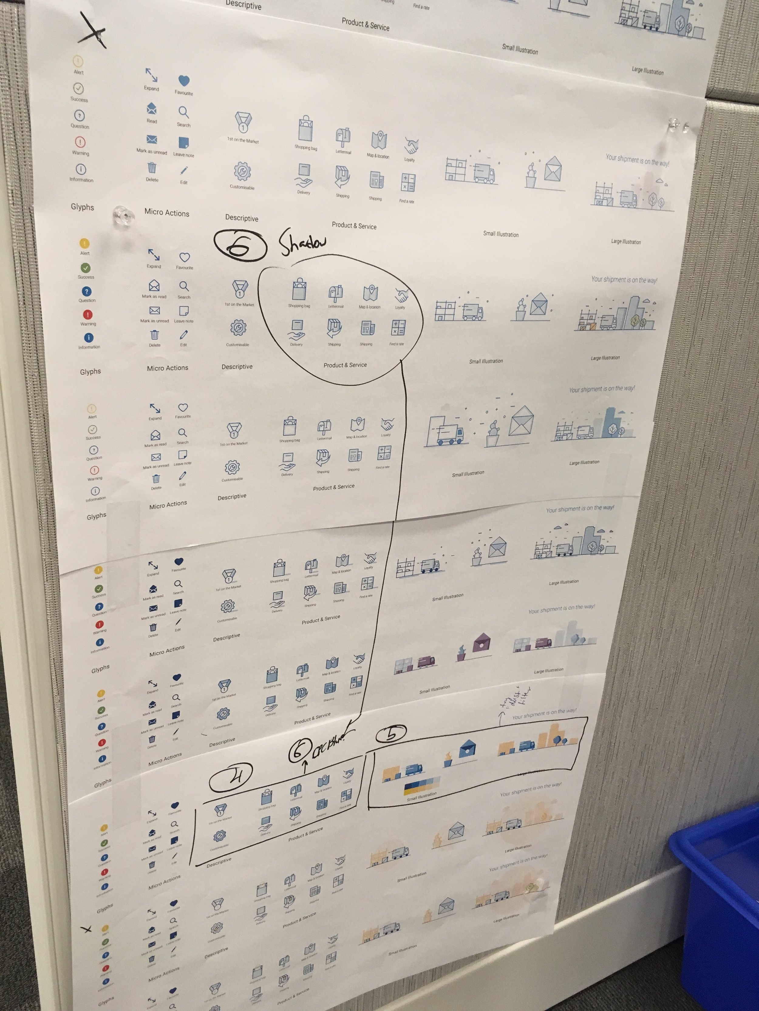
The redesigned iconography and illustration spectrum shows how elements scale for many use cases.

Illustrations supporting one of Canada Post’s product pages, making content more digestible.

Illustrations help break up content, giving the user a break from reading as they learn more about Canada Post’s services.

An illustration used to represent the visual design section of Canada Post's style guide.

A set of 8 (out of about 150) icons used throughout Canada Post's digital and physical ecosystems.

A 404 error (my personal favourite).
What I learned
1. You need to grow to deliver great work. Your mindset and willingness to stretch yourself as a designer are some of the most important traits you can have—more so than your baseline design skills or knowledge. At the start of this project, I was intimidated but I stuck with it and found a solution.
2. I’m always amazed at how many people will go out of their way to help you. I reached out to Zack Roszczewski, an amazing illustrator, asking for advice. He was nice enough to send through a really helpful guide that made a huge difference in my work.