Autopilot: creating a new app and design system
Autopilot is an automated marketing software company that helps businesses keep in touch with their customers and grow. We redesigned our app in order to simplify the core experience and acquire thousands of new users.

Challenge
Create a new, more intuitive app that that allows Autopilot to acquire thousands of new users.
My role
User research, interaction design, UX writing and visual design
Worked with 2 other designers, developers, stakeholders, support and marketing teams
Outcome
The MVP of Autopilot’s new app, tested and released in under 8 months
Autopilot’s 1st living design system, resulting in a faster workflow for the product team
Helped position the company to add $20 million ARR in the next 2 years
Autopilot’s previous app
Thousands of people love the Canvas, a drag-and-drop interface that gives you full control of marketing journeys. However, it has a very steep learning curve.

The brief
Was there a way to make our core experience more intuitive? Our competitor, MailChimp, has a streamlined experience for creating marketing campaigns. In order to acquire some of their market share, we explored how to cater our experience to their users.
Why we built a design system
To redesign our app efficiently, we decided a design system needed to be established.
Our design system, built using Abstract, greatly increased the speed and efficiency of the product team’s workflow. Our engineering team leveraged our design system to create components using React, allowing us to build and test the MVP of our new app in just a few months.


The process
1. Research and strategy
We researched companies like AirBnB and Asana, who’ve documented their rebrands and design system journeys. We also referenced Atomic Design by Brad Frost.
Once we understood the scale of the project, we created a road map.

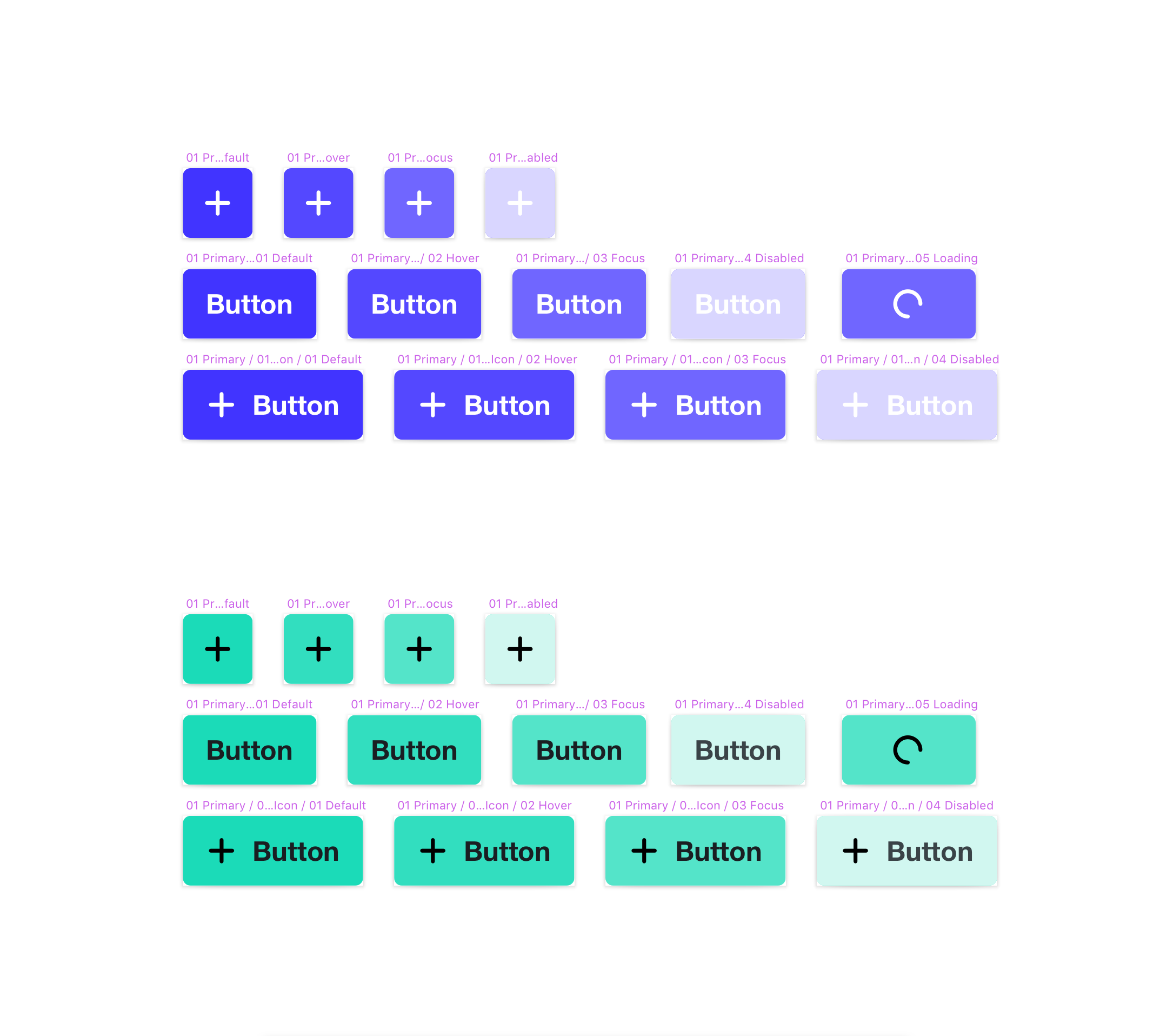
One of the inconsistencies we found: an off-brand orange, inaccessible CTA.
2. Visual audit
Next, we analysed our product ecosystem and noted which components to revise or remove. We prioritised high-mileage components like CTAs, tables and modals.
We revised our typography, spacing system, layout grids, navigation and IA. We thought about how current and new features fit into our IA, which sparked early conversations on navigation and responsive design.
We found that our current buttons, icons and links didn’t pass WCAG’s guidelines for accessibility. For our company to mature from a scrappy startup to a leader in our industry, we’d need to do our part to ensure accessible design.

The navigation, buttons, dropdown menu and table are high-mileage components used in many other sections of our app.
3. Building and testing the MVP
Campaigns, the MVP of our new app, is our solution to a key user pain point: the learning curve of our previous app.
Because our workflow had become so efficient, we were able prototype and test this feature in the browser in under 2 months. This helped us gather user feedback in order to validate and refine our new IA, navigation, components and styles.
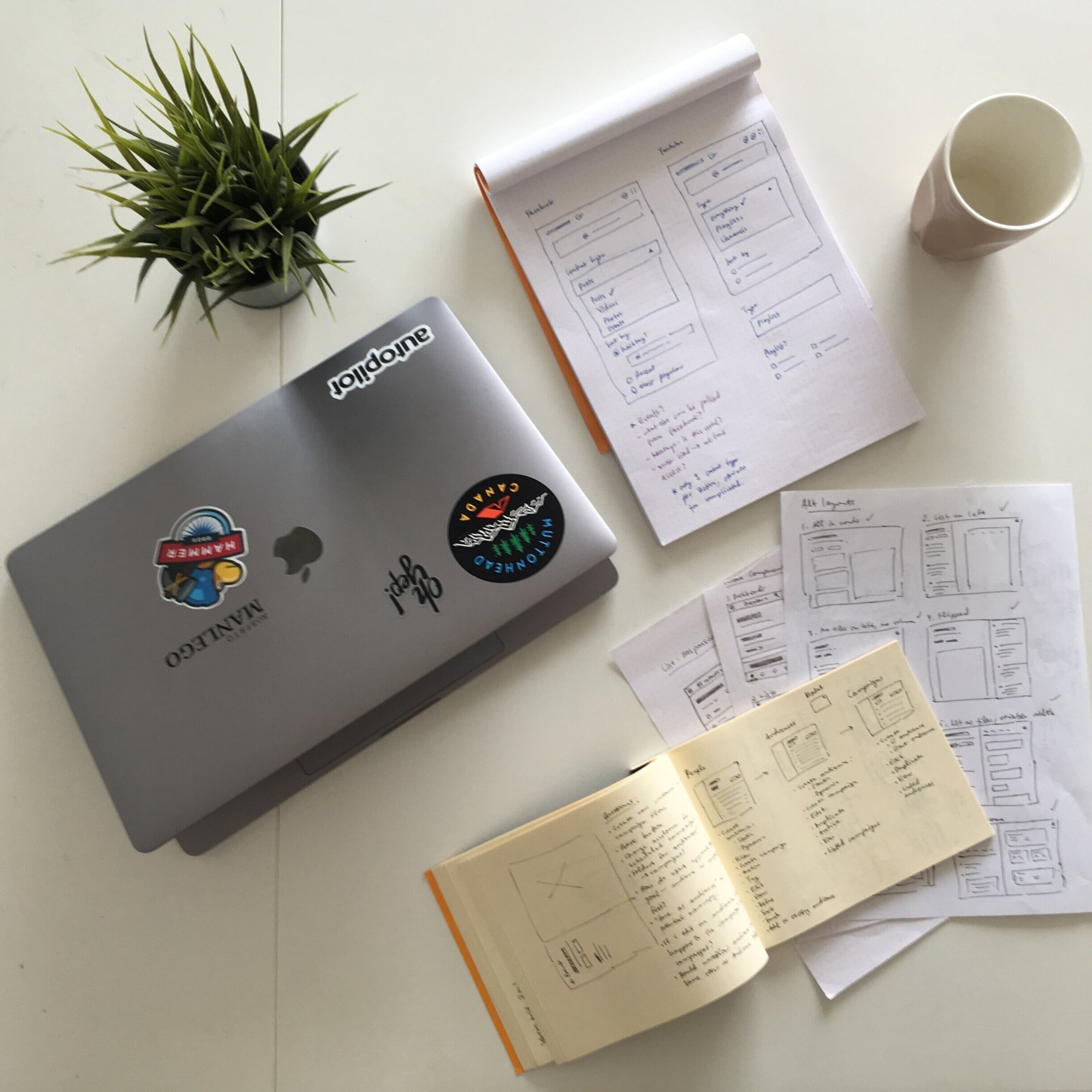
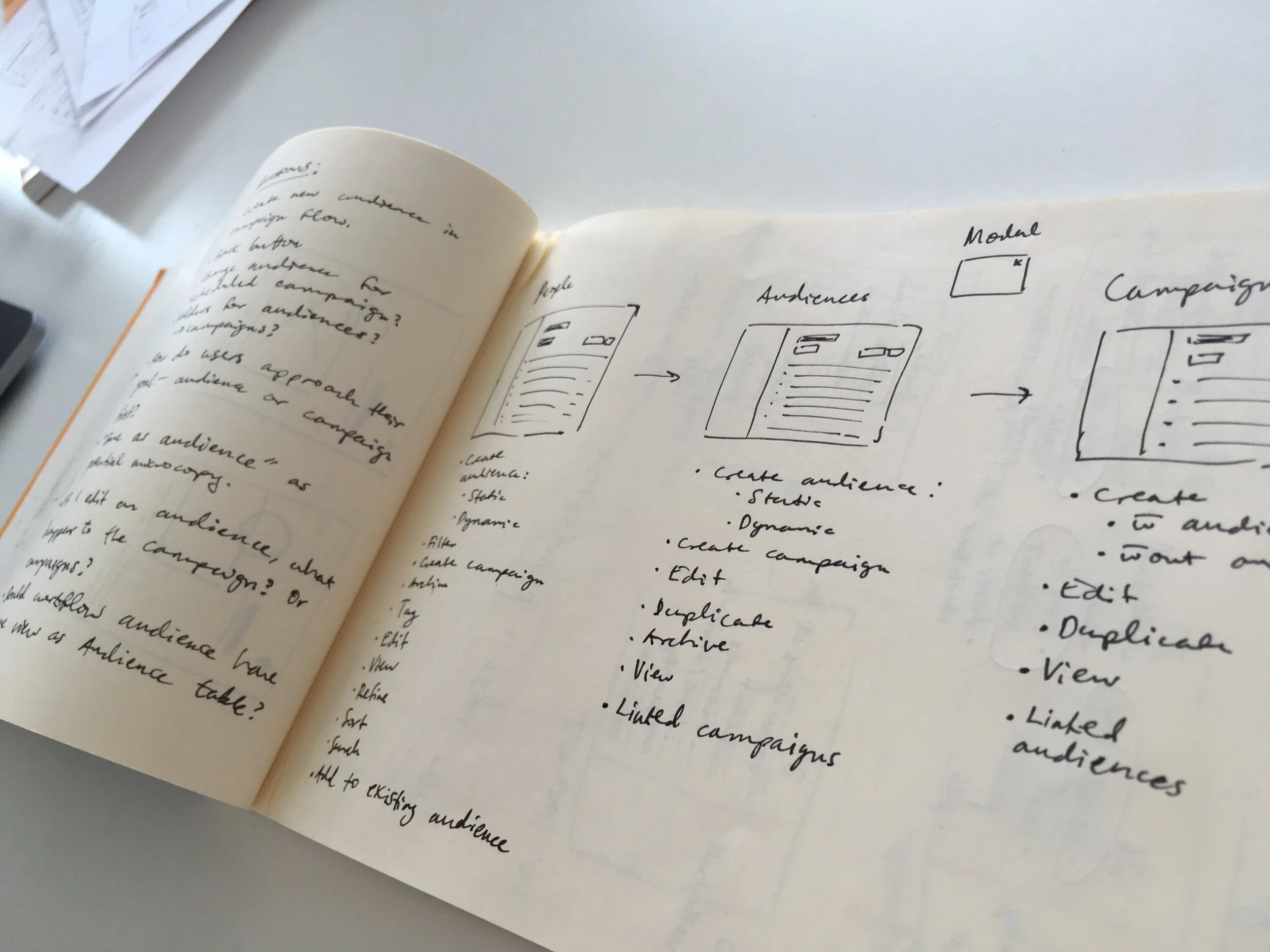
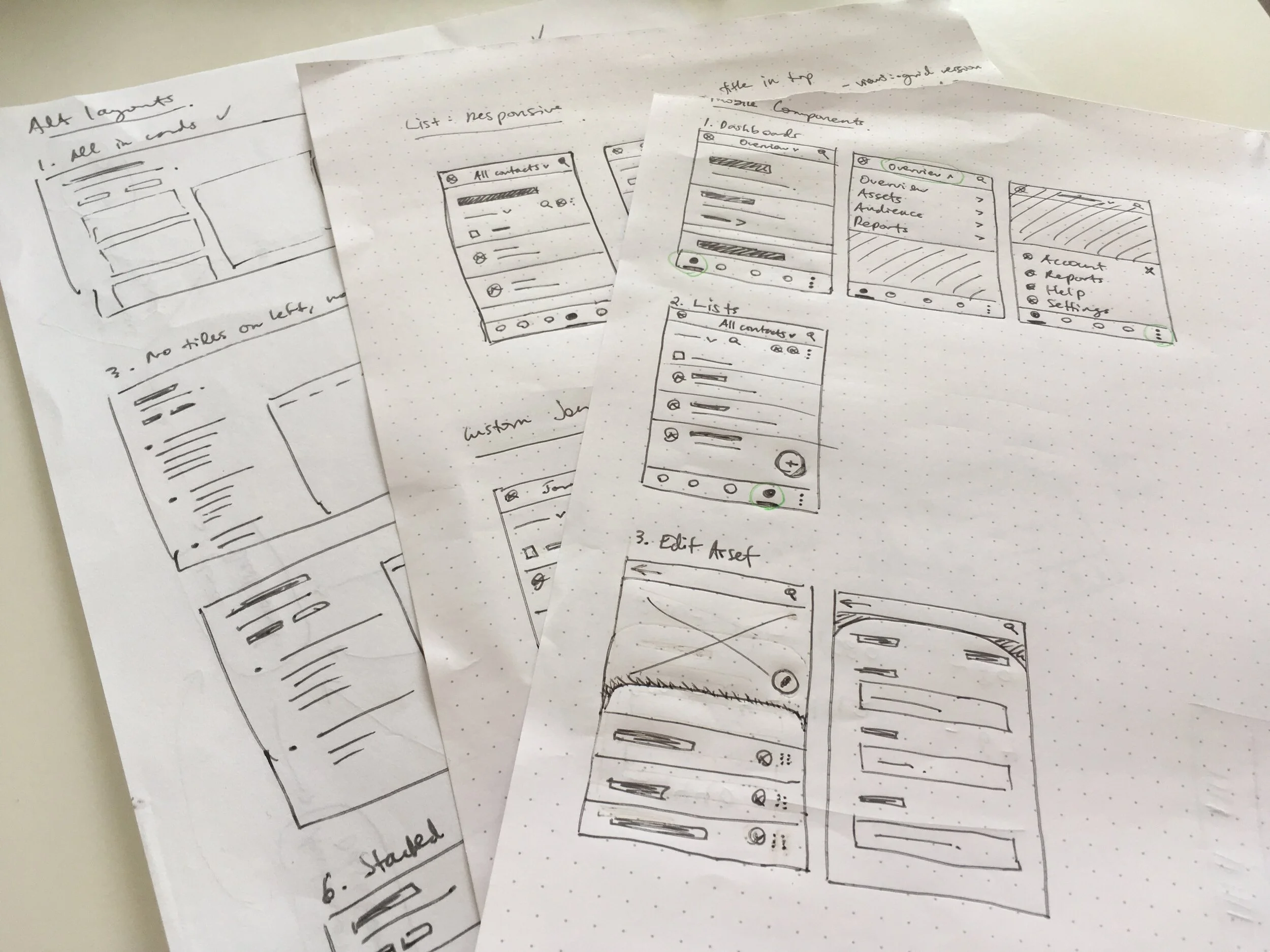
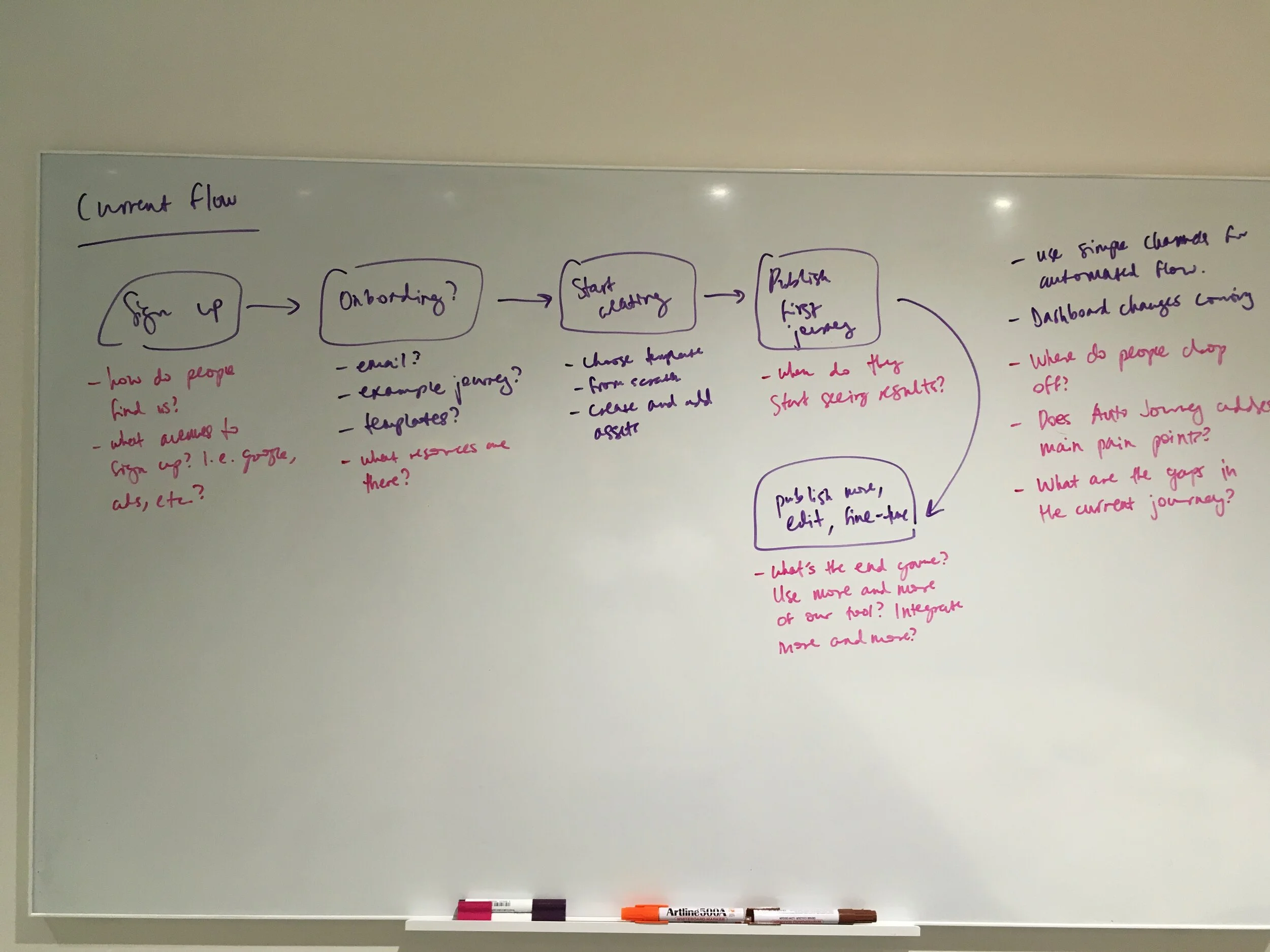
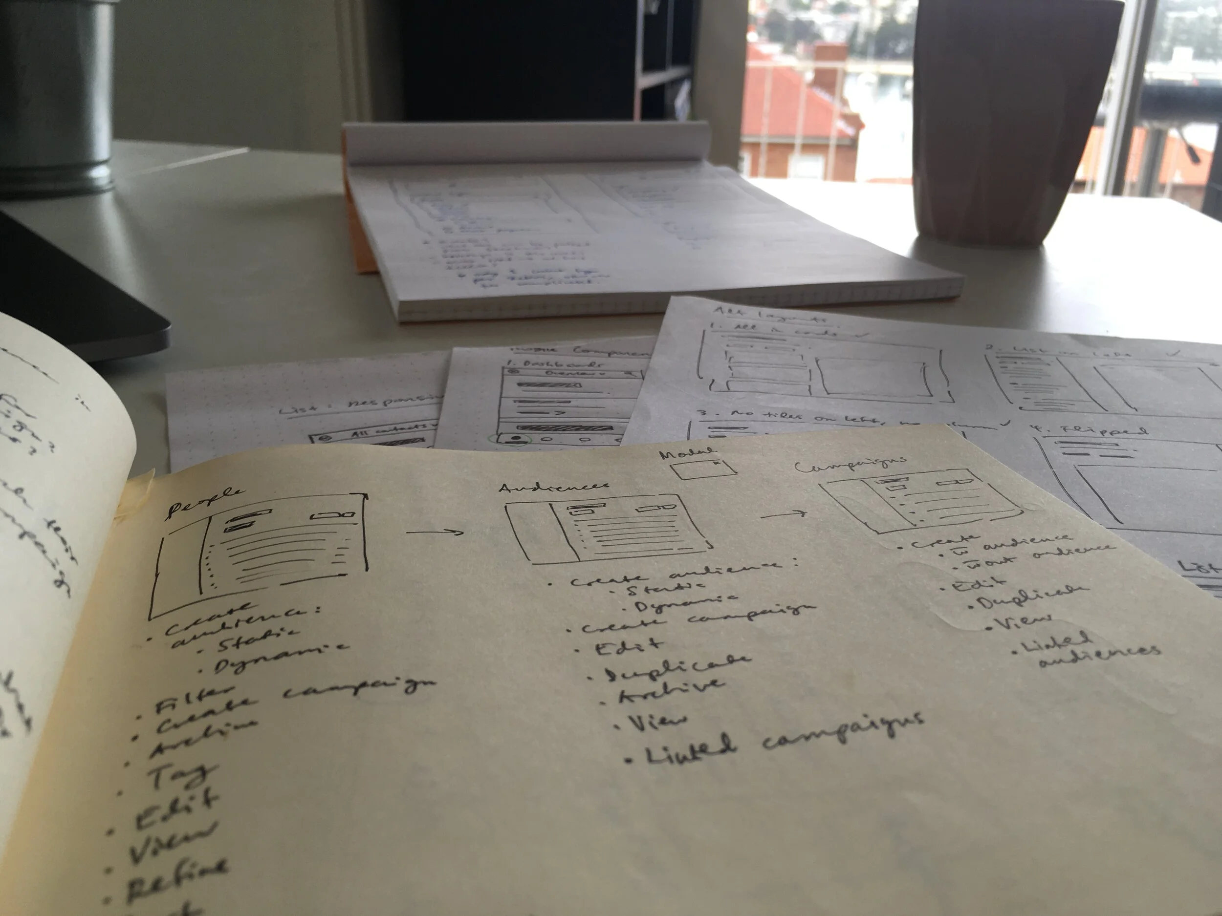
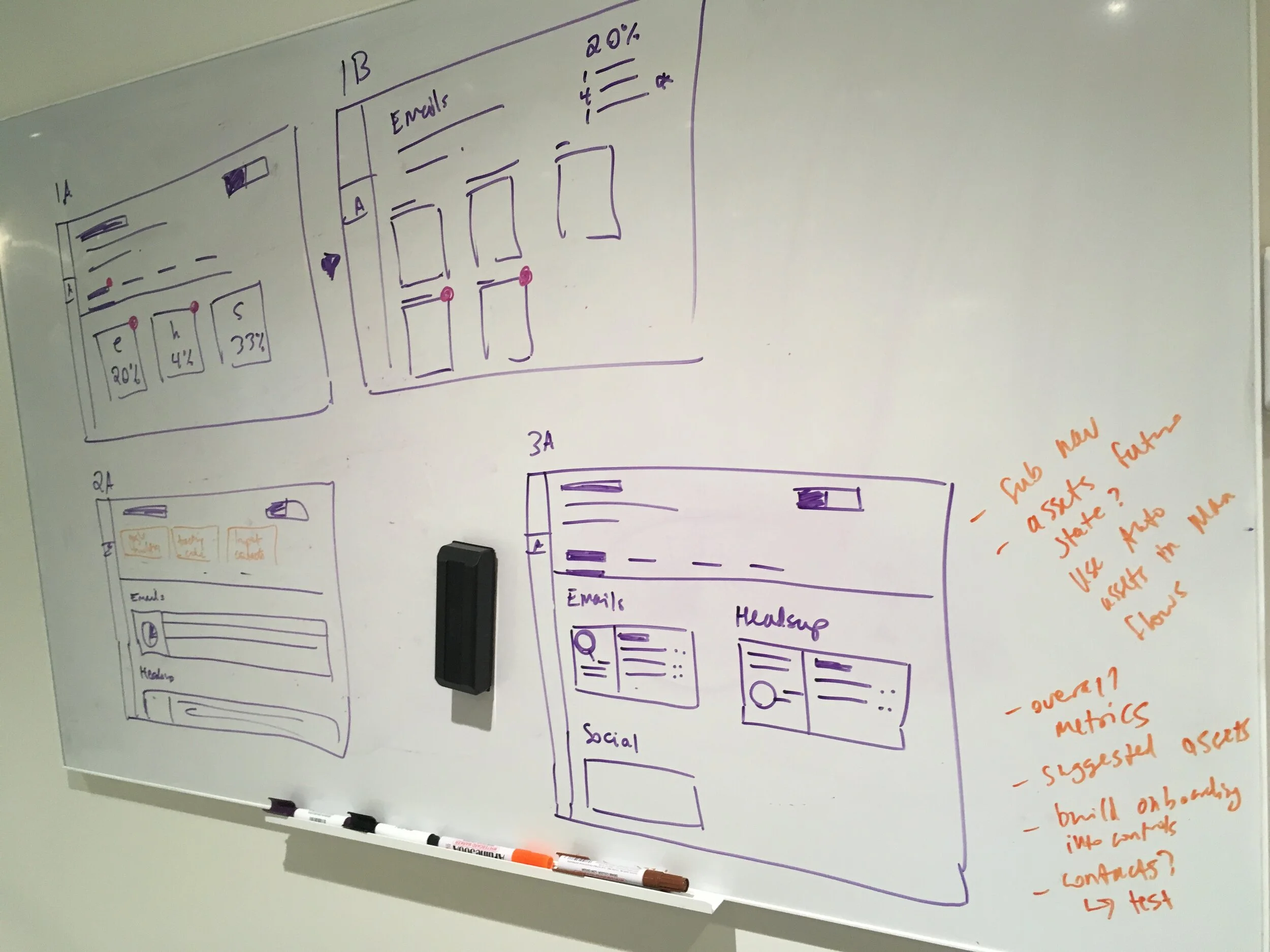
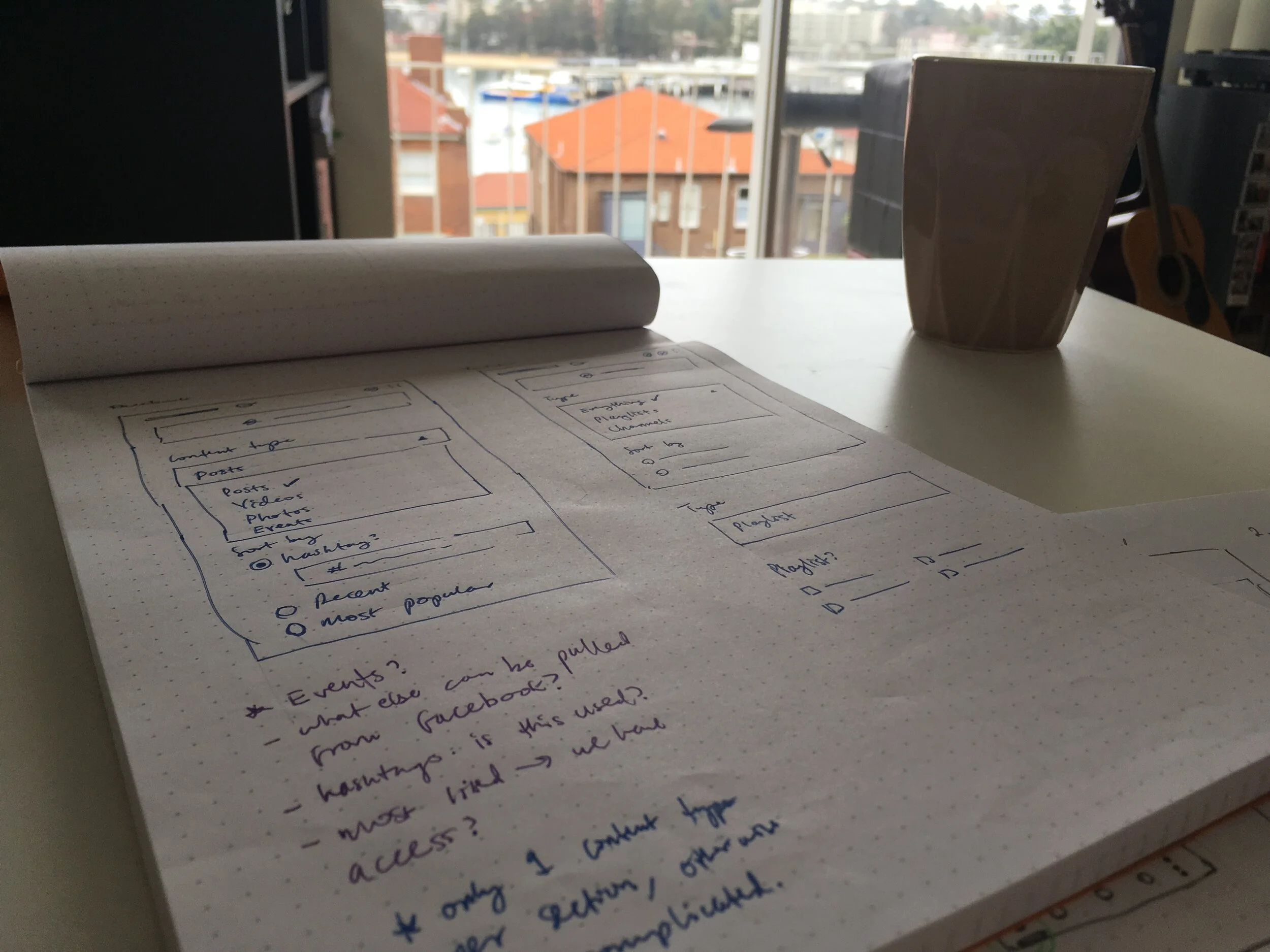
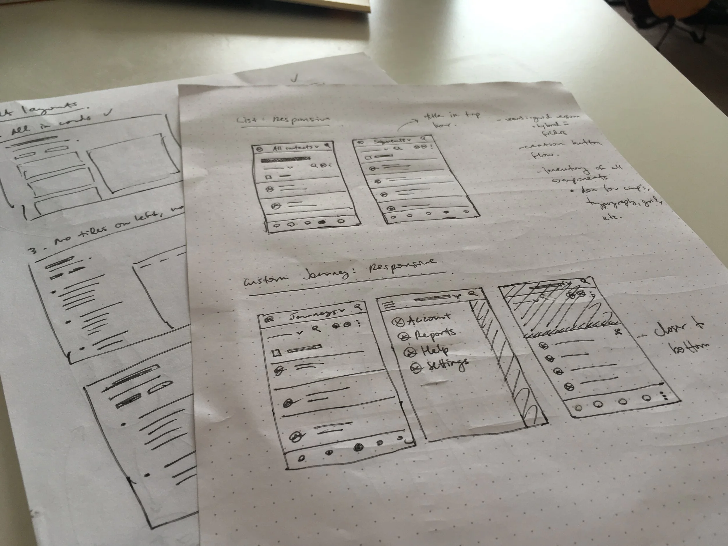
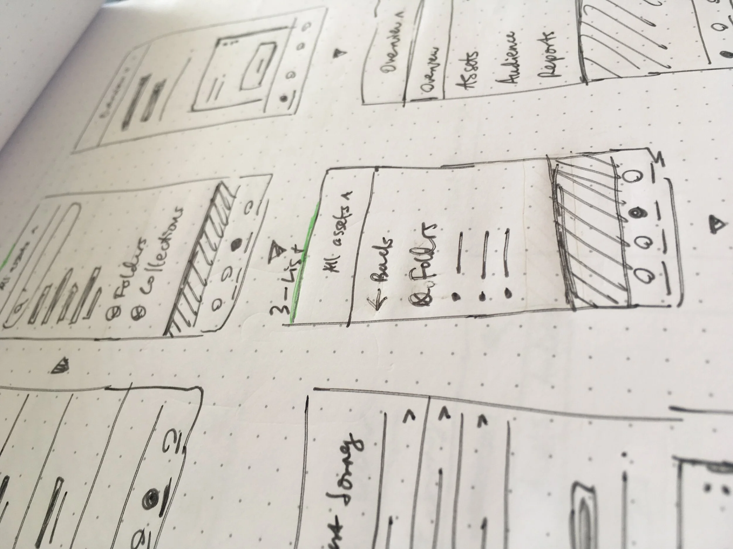
Rough work and sketching
Below are some examples of the process work that helped us explore ideas, turn insights into design solutions and make difficult decisions as we built our new app.

A note on interaction color
Using our brand black for CTAs, links and icons worked at first and was a great solution for accessibility. But as the interfaces grew more complex, buttons and links became hard to see.
To make our designs accessible and make our clickable elements discoverable, we experimented with purple as our new interaction colour.
Before: black links, tabs and secondary buttons are difficult to see at first.
After: interactions are more discoverable, like creating a new field on the left panel and the tabs on the right
The outcome
Our new app allows users to create marketing journeys in a more intuitive and efficient way. We received overwhelmingly positive user feedback in our rounds of testing.
With this redesigned core experience, Autopilot is now positioned to add $20 million ARR over the next 2 years.
Autopilot’s 1st design system is a mark of an evolving mindset—from scrappy startup to mature industry leader. It’s the foundation for efficient product team workflows, bringing in new talent and taking on bigger challenges in the automated marketing software world.

Landing page: rebranded and simplified to match our new responsive app.

Campaigns: a high-mileage component, the table, is used in multiple sections of the app. Included are interactions like creating new campaigns and refining your search.

Campaign creation: a simple, linear flow that's familiar to target users.

Responsive designs: early in the process, we thought about how our IA and navigation would translate responsively.

Global search: allows faster workflows for businesses that have many marketing campaigns and contacts.
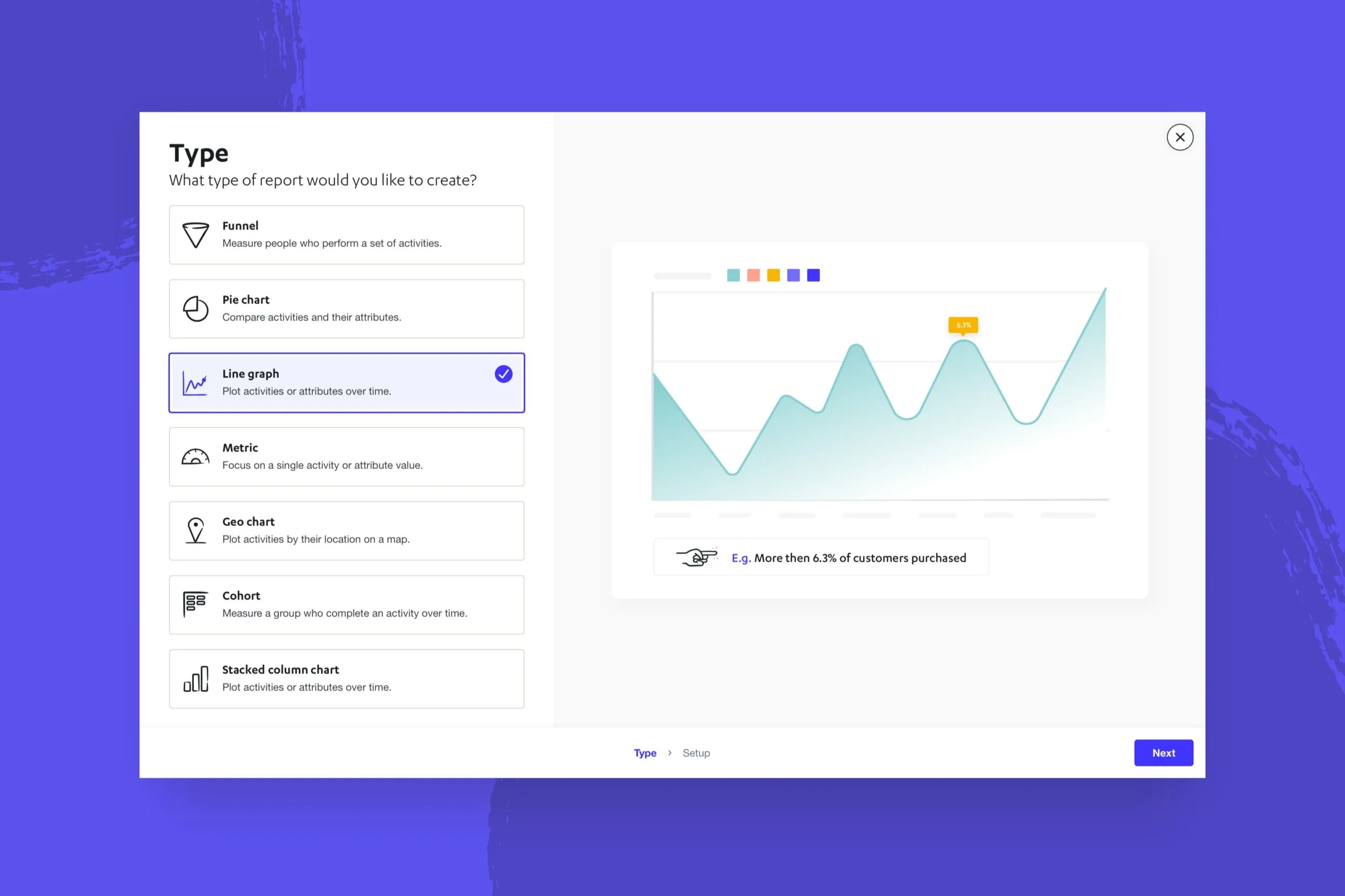
Reports: we reused the workflow, a validated component, so that creating complex reports feels familiar and easy to learn.

Contact profile: we chose a new brand colour, purple, that makes interactions like moving fields and refining lists more discoverable.
What I learned
1. You don’t have to have the entire process mapped out from start to finish. I normally relax knowing that there are tried and tested processes to follow. Sometimes, though, this isn’t the best approach for a project. Your process can be thought of as a living thing that evolves and adapts as you try things and learn.
2. Its important to really know your users and the market. Throughout designing our new app, we constantly circled back to our target market and users. Looking at the experience as a small business owner—where efficiency is a priority and marketing knowledge may be limited—helped us make important and timely design decisions.